7 of the Best iOS 10 Features to Use Right Now
Want to know what some of the best new features of iOS 10 are? While there are well over a hundred changes, features, and enhancements to iOS 10, many are subtle and some are major, some you’ll use and some you won’t. We’ll be covering tons of the great tricks and features for iOS 10 as time goes on, but for now let’s review seven of the handier features in iOS 10 that you can use right away on any iPhone, iPad, or iPod touch.
Obviously you’ll need to have installed the iOS 10 update to have access to these new features. If you haven’t done that yet, complete the update on your iPhone or iPad and then read on for some of the best features you’re likely to appreciate.
1: New Widget Screen and Lock Screen
You’ll notice the lock screen has been redesigned in iOS 10, but the real joy is when you swipe over to find the new widget screen. You can’t miss it, the same gestures which used to be ‘slide to unlock’ is now slide-over for the new widgetized screen. You’ll find detailed weather reports, calendar events, Siri app suggestions, news headlines (tabloid headlines is often a more accurate description, you can turn them off if you’re not into gossip), stocks, maps destinations, music controls, and much more.
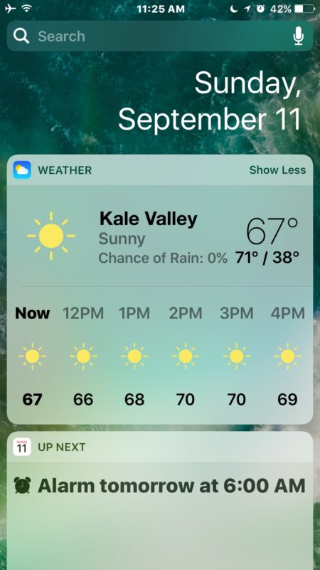
The widget screen is customizable too, just scroll to the very bottom of the the widget display and tap on the “Edit” button.
One of the biggest perks of the redesigned lock screen? Faster camera access. Just swipe left on the lock screen and you’ll instantly launch into the camera.
2: All New Messages with Sketching, GIFs, & Quirky Fun Features
The Messages app in iOS 10 has been completely revamped with a huge variety of fun new features which range from the ability to sketch out notes and drawings, to insert animated GIFs and “stickers” (stickers being images that are preselected by an accompanying sticker app found on the App Store), Message apps, and many quirky features which include everything from message effects to in-line contextual responses. Open the all new Messages app and poke around, there are many new buttons and options in individual message windows now which reveal the sketching tools and various digital touch features, along with sticker packs, message effects, and in-line responses.
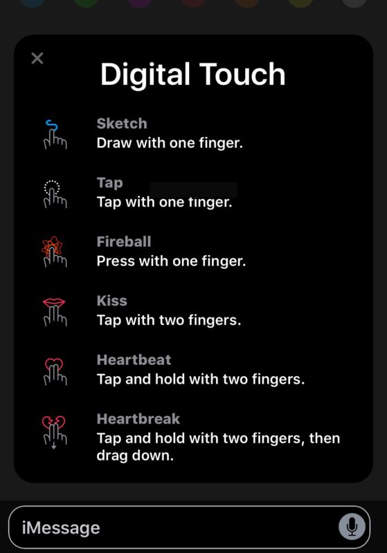
The new Messages app in iOS 10 may be the single biggest change in this software release, so it’s worth poking around and exploring to see all that you can do.
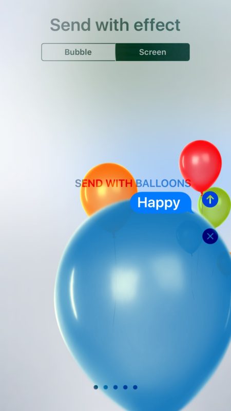
For best results, send and receive messages with other iOS 10 users, since those on older iOS and macOS versions will not be able to see the fancier effects.
3: Message Link Previews
How many times has a friend, family member, or colleague sent you a message with a link in it, and no explanation of what that link is? Countless, right? Now with iOS 10, you don’t need to wonder what the tapping the URL will bring because the Messages app will preload a preview of what the corresponding webpage is. Typically this means you’ll see the domain, the linked webpage title, and a thumbnail image from the link in question.

The link previews work for most URLs, and while they aren’t 100% effective for all URLs it is consistent enough to be helpful, allowing you should to weed out whether a link is either appropriate for now, best for later, or even worth visiting in general.
4: The Magnifying Glass
The Magnifier accessibility feature in iOS 10 is sure to be popular with many users. Essentially it turns the devices camera into a magnifying glass, and it’s accessible with a quick triple-click of the Home button. The next time you’re trying to read the microscopic fine print on some piece of paper, or the tiny text on a nutritional label, pull out the iPhone and you’ll be able to use it to greatly boost the size of the text and read, much like an adjustable magnifying glass.

To turn on the Magnifier option, go to “Settings” app and then to > General > Accessibility > Magnifier and toggle the feature ON. You then just triple-click the Home button to access it. Undeniably useful, enable it and give it a try.
5: Removing Bundled Pre-installed Stock Apps
The ability to remove the pre-installed default apps in iOS has been long desired, and with iOS 10 you can finally do just that. Yes really, you can delete the stock bundled default apps in iOS 10 now, and it works just like uninstalling any other iOS app. Just tap and hold on a default app and press the (X) to remove it.

You can trash Mail, Music, Stocks, News, Calculator, just about any the default preinstalled apps you or may not use can now be removed. There are a few that can’t be deleted which have core system functionality like Safari, however.
6: Voicemail Transcription
The iPhone with iOS 10 can now listen to your voicemail and transcript the message for you, this means you can see read a voicemail someone left without having to listen to it.
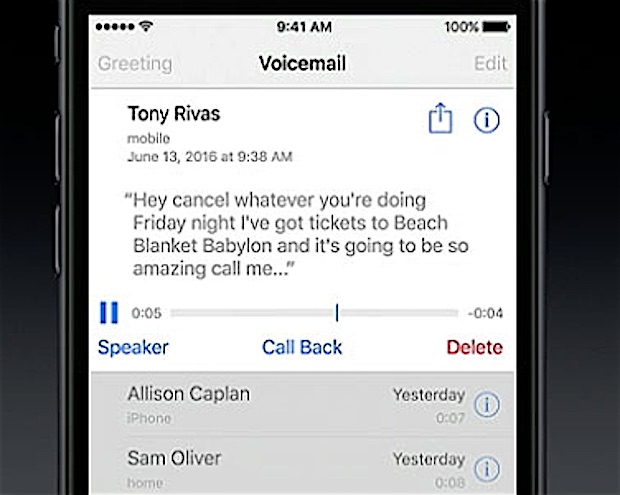
This is wildly useful if you’re in a meeting, class, or any other place where reading is much more appropriate than pulling out your iPhone to listen to. The main catch is that your iPhone carrier must support visual voicemail, if there is no visual voicemail support then you won’t have voicemail transcriptions either.
To see a voicemail transcription, wait until a message has been left, then go to the Phone app and Voicemail section. Tap on the voicemail in question and in a moment or two the transcription should appear directly above the visual voicemail timeline. Neat huh?
7: The Multilingual Autocorrect & Keyboard
Whether you’re bilingual, multilingual, learning a new language, or just like to insert random foreign words into your conversations (“oui oui je suis”), the new iOS 10 multilingual keyboard capabilities is sure to make your life easier.
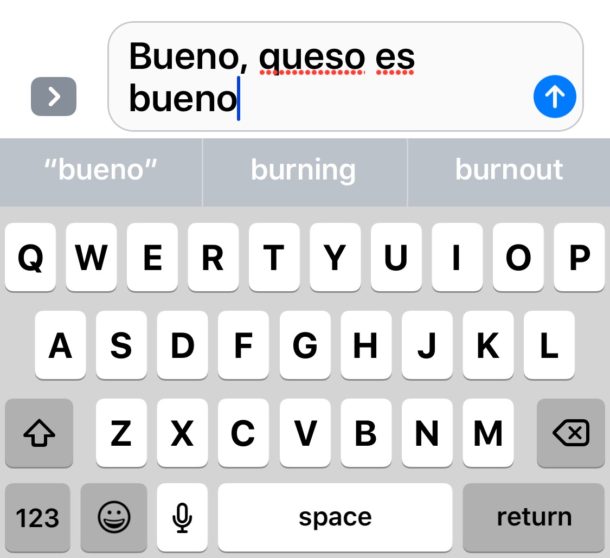
Essentially what this means is that autocorrect will no longer butcher your messages if you’re mixing your iPhone or iPads default language with another language identified in the iOS keyboards. For example, you’ll be able to type ‘au revoir’ without it autocorrecting to “at devour” and “bueno” without it autocorrecting to “Bruno”. To get access to this feature, you’ll need to add the additional language dictionary and add the new keyboard language to change to and from – that’s it, autocorrect will now read from both the additional dictionary language and the additional keyboard language.
This may seem like a subtle change, but for polyglots and those learning foreign languages, it can make a world of difference, and you’ll no longer need to compromise and disable autocorrect in iOS to avoid those whacky autocorrections of proper but foreign words.
–
This is obviously just a small handful of the new features and changes brought to iOS 10, and we’ll be covering many more in the future. Do you have any favorite iOS 10 features? Let us know in the comments.


my iphone use paswd 4 digit, but i don’t like this lock, i want use slide to open,, how i want change to use slide to open, please some body teach me
The preview link (listed as point 3 above) is a serious security risk. A fair amount of phishing campaigns now send a speculative email with a link to see if an address is both genuine and also live. The preview link option now loads the page and proves the addres is valid. This should be a disable-able option in my opinion. It also makes it harder to view the actual link behind the fake one…
Hate the addition of the handwriting on iMessage in landscape mode. It made the space bar smaller and I keep hitting return by mistake. UG. Hate the removal of GameCenter. Don’t mind the new lock screen – I have an iPhone 5 so it is a separate click but I prefer that to swipe.
I can’t believe these geniuses got rid of the health dashboard with ios10. I don’t know wtf these morons were thinking. Change, just for the sake of change is useless. Guess these people get paid to change things regardless
I just want to hide all the crap in messages so that when I open messages and click on a contact or old message its ready to type.
They just keep adding keystrokes to do the most basic of things.
And omg – can we please just go back to displaying first-name and last-name in the banner at the top of the message!!!!!!!!!!!!!!!!!!!!!!!!!
I simply love the iMessage and cool animations included in iOS10. This is worth installing.
“One of the biggest perks of the redesigned lock screen? Faster camera access. Just swipe left on the lock screen and you’ll instantly launch into the camera.”
I guess swiping left is marginally faster than swiping up because it’s a shorter distance, but really? Not worth the aggravation. I don’t want widgets. I don’t want *any* functionality when the phone’s locked – that’s why I’m locking the damn thing!
I’m surprised that so many people dislike the updated Music application; I think it is such an improvement! :-)
Sounds like another OS update I can skip. Bricking Iphones, slowing them down, terrible itunes, more unwanted teeny crap. Inability to revert to earlier OS. All sounds like Dejavu to me. DId we forget how the iphone 4 was turned into a sloooooow phone, ruined with its new —improved-OS that couldnt be reversed. I suspect Apple purposedly programs new OS to be incombatible with older phones, Thereby forcing you to buy a new -faster- one.
Ever since the 4 fiasco I refuse to do any OS updates, and happier for it. As far as Itunes, I havent used it in over 3 years when they ruined it back then, I can’t imagine how it could have gotten any worse. My ipad’s itunes still only has the original U2 freebie that came with it.
No wireless charging on the new iphone7 ????
As for all the teeny bopper crap,thats just to bring them over to Apple who for years have been anti Apple, ownng an iphone wasnt Kool.
I cannot figure out the thinking at Apple.
Honestly, what did they accomplish with iMessage, much less the updates? That is the stuff only bored high school kids could enjoy. When I read that Samsung (or someone) was planning to make an iMessage clone, I laughed. Why would anyone copy the most useless feature that Apple ever came up with?
The new Health app is a disaster. I used to get my faves (Steps, Walking, Flights and Weight) in one click. Now I don’t know how many clicks I need to see the data displays. Yes, I can wade through today’s numbers with a couple clicks but getting to the charts? Forget it. And Mindfulness? Nutrition? I don’t want see any of that at all and can’t eliminate them.
I reverted to 9.3.5 and will stay there until somebody make sense of Health.app.
Usually I find myself on the other side from the naysayers and complainers. It is different this time! As someone said, “all this teenage stuff” I agree. Maybe 10.2 will give us the option to turn off some of the crap–such as most of the glitzy text message stuff. I’ve never like music app. Designed by committee and schizophrenic. At least I could get rid of that stupid home button!!!!!
Does the ios 10 update re-opt me into all the stuff I do not use?
IMessage
Facetime
Gamecenter
…
Game Center is no more in iOS 10.
That is awesome news!
When bought my macbook air, I was so disappointed to see gamecenter, iMessage, and other useless stuff there as well. After about a month I had enough of OS-X and wiped it out. I run Linux.
Apple has a lot to learn about including bloat and opting us in by default.
Many of the Apple default apps only proved that Apple employees have a bad sense of humour. Like I really wanted all my devices to ring when I get a wrong number in the middle of the night! Seriously? What the Hell were they thinking?
Could not disagree more about GameCenter. I’m beyond irritated that they removed it and am considering wiping my phone to go back a step.
IMHO, the new Widget screen just sucks: too many interruptions between widgets and too many space inside every box that waste too much height space.
Yes, I own an iPhone 5s, the smaller screen iOS 10 is compatible with, but has (or ‘is’) the same screen size of the newer iPhone SE.
It seems like a subliminal message from Apple: “buy an iPhone 6s or 7, better if it’s the Plus version…”
And what about the fewer contrast between icons and white background?
You transcribe a transcription 🎤
I still use my iphone 3 for all music apps including iTunes, Pandora and playlists from the legal (at the time) bit torrent. The sound is waaaaay better.
I often swap my chip into my Android Note 3 Smart Phone tablet to enjoy the quality and lack of ‘echo’ when speaking on the phone. The iphone 6s is just an apple product weighed down with useless gimmicks, with a lot of the basics being defective IMHO!
The two exclusions are
1.the camera and
2. being able to wirelessly print documents (I use my HP Envy 7460).
Siri is clumsy, getting speech wrong most of the time – quicker to print the question!
iPhone 3’s autocorrect was great but now the 6’s a/c interferes inappropriately with annoying, useless un-called for for corrections which one just has to retype.
I know, the dashboard gives choices of the word as you type and you can alway tap the wrong word with the x beside it, but doing these 2 things are not intuitive and a pain to use when typing at speed.
Autocorrect has always been a thorn in my side but turning it off is not the answer as that has it’s own nuisance problems.
M
I have all the Apple products iMac, MacBook Pro, Apple TV, iPad Air, iphone6 Plus and the iWatch (which is the biggest and most useless gimmic of all)
The Apple TV comes a close second because I have 2 Smart TVs anyway.
Apple has to supply dividends to investors on the stock market, so it relies on suckers like me to buy the latest on offer. Apple Inc also relies on buyers wanting the convenience of having their devices share playlists, contacts, emails & documents etc across the board.
I am now offloading the apple devices I dont use. I’ve wised up!
My iPad2 didn’t make the cut, and I’ll bet my iPhone5 won’t be included in future updates of iOS. I do have iOS 10 installed now on the iPhone5, and while many of the new features appear, I’m unable to get happy balloons and confetti-type cuteness in my messages. I’m assuming it’s because my iPhone is so old. But having seen some of what I’m missing, I think I’m getting the best of both worlds! Happy with what I’ve received.
Only question is: Am I correct in assuming not all the glitz works due to my older phone?
If you have the “Reduce Motion” accessibility setting enabled the iMessage effects will not work. You must turn that off to see iMessage effects.
There should be a separate setting, but there isn’t one yet.
Thanks! I did. I turned it off. I’ll see what happens, and a separate setting would be nice. Gosh.. Just think… balloons!
Siri voice dictation is the thing that most needs improvement. Haven’t read a word about that in all these changes. If I cannot Swype, I need good voice dictation. Siri does not come even very close to delivering.
Swype killed. Siri voice dictation fails. My single biggest issue, Samsung to Apple.
All fine and good, but what happen once again to the mailbox ability to Delete-All-Messages? Seems we’ve again digressed to the days of marking every message to be deleted one at a time. I often get 100+ emails a day and deleting all the unwanted ones is once again a painful experience. I do hope it’s really there and I’ve just been looking in all the wrong, albeit familiar, places… Surely Apple wouldn’t have missed this in their multi-beta-release quality-control environment.
You are kidding ?? The “delete all messages” was fabulous.
The only thing that works for me is removing the stocks app. All I want is a good phone .
I’m really hoping that someone proves me wrong… Seems like every release breaks a previously working section of code. This is usually indicative of too many programmers working on one project with very poor communication between them due to time constraints. Not really an issue with the programmers, but more likely with the scheduling, rushing code out the door.
The delete all in mail is still there.
i cannot get magnifying glass, i turned it on in settings and pushed the home button 3x but no magnifying glass
I still take issue with the wording of “remove.” This process would be far less arcane if they just called it “hiding” and gave a better interface for doing so. Or, ideally, they would get over themselves and treat those apps like third-party ones and truly delete them.
One of my favorites is the revised Photos app with the new slide show feature, Memories, etc.
I agree with Liam that the Music app is worse than it has ever been, so I’m not using it anymore. Cesium is much better!
I removed the “Music” app from Apple which is basically a gigantic advertisement and replaced it with Spotify and Pandora. Spotify is so much better anyway it is not even close.
I think the only new feature I like is conversation read receipts, otherwise I don’t know what else to enjoy or appreciate. Maybe I need to give it more time, but I can think of a lot of things I do not like.
I hate the new lock screen in iOS 10. I hate not having slide to unlock.
I also hate the new messages app, it is so cluttered and slow.
The new Music app is horrible too.
What is Apple doing?
The new music app is the worst piece of Apple software I’ve ever used, bar none.
Music app is your classic example of Design By Committee. It has too much of everything, and none of it works well or is satisfying.
Messages feels similar in iOS 10 too. It is very busy and full of things that do not belong.
This is one of those scenarios where truly Steve Jobs would have said “no” without a doubt.
I hate the new Music app and I hate the new lock screen press unlock thing.
I also wish they could put the iMessage buttons into one button that we could hide because I am a professional and I don’t need all of this gimmicky teenage goof stuff in my messages.
Aside from that I guess it’s an OK update. I like some of these other features, the magnifying glass is nice but I was using the normal camera for that anyway.
The new lock screen is really tilted in favor of Touch ID devices, where the “rest finger to open” pref (stupidly buried in Accessibility) allows one seamless action to access a device.
For a non-Touch ID device, especially an iPad with a smart cover of some type, all it does is add an extra, frustrating obstacle, and eliminates half the benefit to a smart cover. There’s no pref like that above to skip directly to the passcode entry when the cover is opened, like OS 9 and earlier behaved.
But I guess the people at Apple were so proud of the new Today View/Notification screens, they wanted to ram it down all users’ throats.
Those screens have their own serious issues, but that’s another topic.