8 of the Best New Features in macOS Big Sur
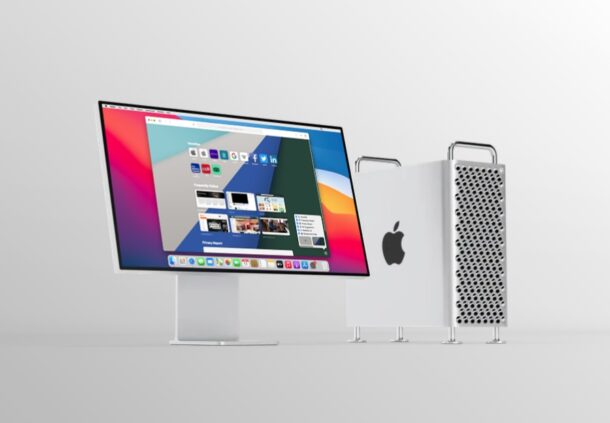
MacOS Big Sur has been out for a little while now, but not everyone is yet running the operating system, and even those who are may not be totally aware of some of the new features Big Sur has to offer.
Whether you’re still on the fence about updating, or just wondering what’s different or particularly great, we’ll going to review some of the best new features available in macOS Big Sur 11.
8 of the Best New Features in macOS Big Sur
There are so many new changes that macOS Big Sur brings to the table, but here are the eight major features and changes that Apple has introduced with this update to the Mac.
1. Redesigned Interface
The biggest change that macOS Big Sur brings to the table is the visuals, and it’s obvious from the moment you first see the major redesign to macOS.
For starters, the Dock is no longer attached to the bottom of the display and it’s more translucent to almost make it seem like a Floating Dock.
Almost all of the icons for the stock apps have been updated to follow a design approach called neumorphism, which is a change from the flat design that was used earlier.
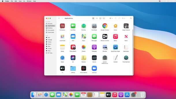
Apart from that, there are rounded corners everywhere and windows have a lighter and more spacious appearance with a lot more white space.
Apple has also redesigned the sheets in apps by removing the borders and bezels to prioritize the content in it.
App sidebars also have a new look to make it easier to find anything you want and allow more space for getting things done.
2. New and Updated System Sound Effects
Apple has updated the system sounds with macOS Big Sur. Alert sounds and other system sounds will be noticeably different when you upgrade from an earlier macOS release.
These new alerts are more pleasing to the ear, and they were created using snippets of the originals.
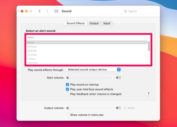
You could check out these new sound effects as you use the operating system, with things like dragging and dropping files, copying files, moving things to the trash, and also by going to System Preferences -> Sound on your Mac after updating.
3. Control Center
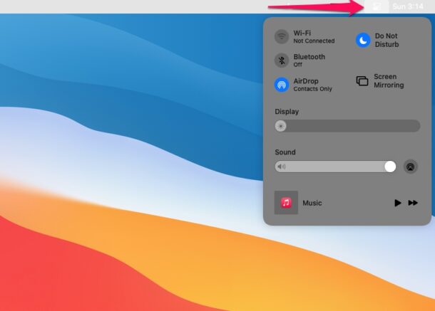
Apple brought an iOS-style Control Center to macOS. It’s redesigned for the big screen, but just like on iOS and iPadOS, it houses toggles for Wi-Fi, Bluetooth, AirDrop, Do Not Disturb, and more.
You can click on the Control Center items to expand the menu and access more options. You’ll be able to find the new Control Center option at the top-right corner of your screen right next to the date and time.
4. Redesigned Notification Center
The Notification Center also received a facelift and groups all your notifications and widgets into a single, dedicated column on the right side of your screen. Notifications are now grouped by apps or message threads. These grouped notifications can also be expanded to view older notifications and messages. These notifications are also interactable meaning you can click and hold on a notification to take action like replying to a message right from your desktop.
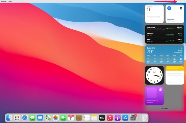
The updated Notification Center can be accessed by clicking on the date and time at the top-right corner of your screen.
To add more widgets to Notification Center, you can simply click on “Edit Widgets” located at the bottom of the Notification Center. There are new widgets for Calendar, Stocks, Weather, Reminders, Notes, and Podcasts. They are also available in different sizes, so you can choose what works best for you.
5. Customize Safari Start Page
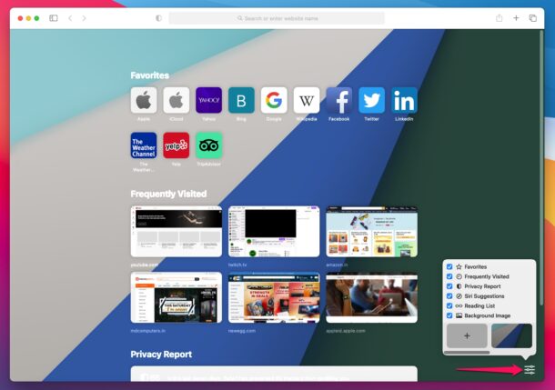
With the release of macOS Big Sur, Apple also introduced Safari 14 which brings a bunch of customization options. Users can now set a custom image as the Safari background and even choose the sections that are displayed on the start page. For example, if you don’t want the frequently visited websites to show up on the start page, you can simply click on the customize option located at the bottom-right corner of the start page and uncheck Frequently Visited from the list.
6. Safari Instant Language Translation
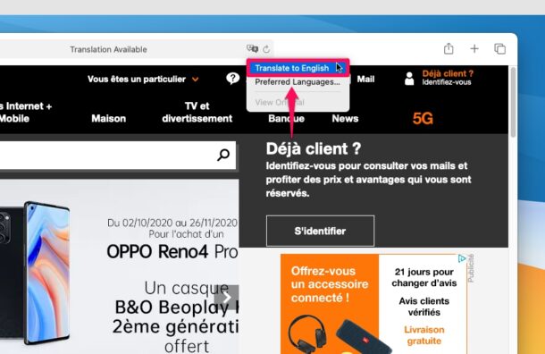
The latest Safari versions include a built-in translator that allows you to quickly translate webpages that are in foreign languages to English. This feature is similar to how translation works in other popular web browsers like Google Chrome or Microsoft Edge.
To use this feature, just head over to a website that’s not in English and click on the Translate icon located on the right side of the address bar. Translation is currently in beta and limited to users living in the United States and Canada.
7. Safari Privacy Report
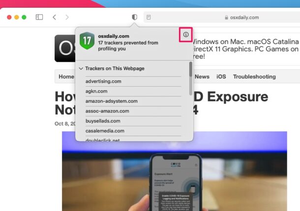
With macOS Big Sur update, Apple is putting its users at the forefront of privacy. On Safari 14 and later, you can check the Privacy Report for a website by clicking on the new shield icon located to the left of the address bar. This lists out all the trackers that have been contacted by a specific website, which are usually from advertisers and analytics scripts. You don’t have to worry about these trackers though, since Safari automatically prevents all these trackers from following you or profiling you across websites. Safari’s Privacy Report makes use of DuckDuckGo’s tracker radar list to keep track of things, and to further safeguard your privacy.
8. Messages Improvements
The Messages app has a ton of improvements and new features with the macOS Big Sur update. For starters, message effects are now on the Mac after originally being introduced in iOS 11 three years ago.
You can now reply to a specific text message in a thread with in-line replies, which could be useful in group conversations. To do this, simply right-click on Control-click on a text bubble and choose “Reply”.
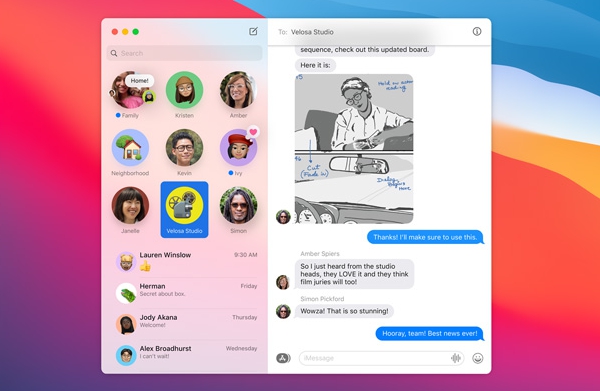
Mentions is yet another addition that iMessage users have been requesting for so long. You can now mention a specific contact or group member and notify them even if they’ve muted the group chat, depending on their notification setting. All you need to do is type “@” followed by their name. Apart from these features, you can now pin message threads so that the conversations that matter to you always stay at the top.
–
These are just some of the major changes and features to keep in mind and try out once you update your Mac to macOS Big Sur, but there are many other smaller and more subtle changes and features too. From visual overhauls to privacy improvements, the newest version of macOS has a lot to offer.
If you’re not yet on macOS Big Sur but you’re ready to take the plunge, you can prepare your device for the macOS Big Sur update, then install macOS Big Sur. Before you go ahead and try to update your Mac to the latest operating system, always make sure you’ve backed up all your valuable data using Time Machine. This is to avoid potential data loss in case the software update fails and ends up bricking your Mac. Also, check if you have at least 20 GB of free storage space on your Mac to download and install the update.
Once you update if you have found you have any issues, you can review our guides to speed up macOS Big Sur if it feels slow, resolve wi-fi issues with macOS Big Sur, and learn to troubleshoot other common issues with macOS Big Sur.
What do you think of macOS Big Sur so far? Do you have any favorite features? Have you been using it since the beginning, or did you delay updating until a point release update that you’re comfortable with like macOS 11.1, 11.2, or 11.3, or even later? Let us know your experiences and thoughts about macOS Big Sur in the comments.


Apple quality has been going steadily downhill ever since the demise of Steve Jobs, and judging from the comments here, this ‘upgrade’ follows the pattern. BS is indeed BS :)
I’ll stay with Mohave thank you Apple. I like to replace some icons (like Finder’s smiley face) and remove pointless (to me) apps like News and Stocks. Mohave is the last OS that allows that. Besides, my Mac is a Mac, not a desktop iPad or iPhone.
“Besides, my Mac is a Mac”
So much this! It seems like most of the new “features” over the last decade have just been to further the iOS-ization of the Mac. And this listicle promotes “8 of the best new features!” and the first 5 aren’t even features, just random changes to the look and feel (and not necessarily for the better).
Unfortunately, we’re stuck, because the alternative is even worse.
I think Big Sur is the worst Mac OS upgrade I ever did. So much so I doubt I will stick with Mac’s very much longer. Both my Mac mini and 2020 Intel MacBook Air run slower and the MBA has significantly worse battery life besides running a bit warmer at times. I guess after a few updates Big Sur is a little better but it was not what I wanted in an evolution of Mac OS. I can understand why some stick with Mojave because it’s probably the last stable Mac OS versions in recent history. I mean even the M1 mac’s have serious issues with Big Sur and it was designed around the M1 chip. If anything the Intel Mac’s suffer with Big Sur because they are now legacy devices. Here I thought Catalina was bad, but now I know it can get worse with Big Sur.
I am also on Mojave and are more than happy with it.
The looks of Big Sur do nothing for me.
But, as Peter says, I can still run my 32-bit apps-a big Plus.
But the main reason I decided not to switch was that Big Sur did not allow SuperDuper! to run anymore. This is a major failing.
Big Sur may have lots of peachy new stuff, but I’m not taking my computers to it as long as the reminders function in Calendar remains screwed up.
To me, this is NOT a free upgrade. I have Adobe Acrobat, a license I paid $600 +/- for. Now that Mac OS is 64 bit architecture, I need to buy another Acrobat license for another $600 if I wish to continue to use this app. WHY is there no backwards compatibility for these situations?
1. Unnecessary whitespace so that the screen real estate of my Air looks 25% smaller.
2. Ugly sounds.
3. Yawn.
4. Does this still crash the first time each day on Intel Macs?
5. Yawn.
6. Really nice.
7. Ultra yawn. I looked at the report once and then never again.
8. Try to drag a non-image from Messages to the desktop. You will end up with some bytes and not the full file. Saving to downloads works, though.
BS is more fluff any anything solid. And the bugs…
There is nothing what I need. New toys which slow down my working.
Mac is for serious work.
My tests (Photography) have shown that there is no benefit but more trouble. So in the near future I won’t update.
What’s new on Big Sur for me is losing the ability to use the Web Cam on my MBP. A Web trawl indicates that I am not alone and apparently when said people contact Apple “it is a hardware fail”.
Maybe it is, but I am wondering why more than I have experienced this after updating an existing and fully working Big Sur 14 with a point update. I have since managed to get to 14.3 and the problem is still there. Everything else appear to work. But system report says I have “no camera”!!
Quick idea of the scale of this would be handy.
I will wait and see. And maybe I am going to skip bigsur.
From the only picture here, I’m not impressed at all.
Toooo flashy, toooo bright, toooo superficial….etc.
Steve Jobs wouldn’t do that, I’m sure. He had an exquisite aesthetic style. These bright colors…what are they ? big sur??? are there other options to choose ? Like all the previous beautiful photos of nature, instead of blobs of flashy paint ?
After Leopard, all OS iterations that followed have eroded my Apple fandom down to about 50 percent of its former value, and it is still declining. Fortunately for Apple the 50 percent that is left is way higher than my regard for Windows, but temptation is starting to set in.
Sure, some nice elements have been added, but for the time period it covers since Leopard (2007), the amount of fluff makes up the majority of the changes. And the good changes have taken too long to materialize. Hopefully 2021 brings a real change to the OS.
I think it was Snow Leopard for me…I still run in on some of my machines.
I also have Snow Leopard on a 2010 MacBook Pro, it is by far the fastest ‘feeling’ Mac I have, even though it is slower for many things and has a HDD rather than SSD. But boy, Snow Leopard is so lean, everything is so snappy, like moving windows around, using Finder, etc. It bogs down with multiple things open but the snappiness is just not there in modern Mac versions – too much animation and eye candy maybe I don’t know.
Still concerned how Bug Sur will handle Office 2019 and Adobe Photoshop Elements. I understand there problems remain with this new system.
One very bad aspect of Big Sur relates to the loss of functionality in Calendar. Specifically, you cannot choose to snooze a notice for a length of time of your choosing; e.g., 5 minutes, 2 hours,1 day, a day before, etc. I believe that a choice of snooze lengths has been a part of Calendar for a very long time. In Big Sur it will snooze only for about 10 minutes and then come back. This makes calendar so useless to me and so irritating that I went back to Big Sur as soon as I became aware of this. It is a truly awful step back.
If those are the “Best New Features,” I think I’ll stick with Mojave on my main Mac as long as possible. Aside from a few features here and there, Big Sur feels like more degradation of the Mac experience in favor of design for the sake of fashion, not function. What a shame.
Ditto. Mojave is nice, Catalina is worse. Unfortunately, it’s now the minimum for various apps. I don’t like the continuing iOSification of the Mac, but it’s hard to argue Catalina is actually better than Big Sur. I think the exception is Messages, which is better native IMO, despite the limitations. In general though, it’s hard for me to justify moving on from Mojave—in fact, I purchased my 2019 iMac with the explicit goal of running it. My M1 Mini is a different story; before it gets turned into a server, it probably will indeed spend a lot of its time running iOS apps and essentially being a secondary Mac with no requirement for bootable backups or especially advanced tinkering. Windows is still on the horizon for me, but I don’t know yet. Still trying to decide. The Mac is still a great platform but it’s undoubtedly changing, and it just may no longer be a good fit as a primary OS. Particularly ironic since iTunes (still available and updated on Windows) is one thing I wish to keep running. M1 is excellent lock-in for Apple; without BootCamp, the Intel Macs clearly have the last laugh for anyone in this situation. Who knows, perhaps it ends with me running Windows on my iMac, and me buying an M1 Air to do those few Mac things …
I am running macOS Big Sur 11.3 on my M1 Mac, I may update my macOS Mojave Mac to macOS Big Sur 11.3 or 11.4 but I will see.
The trouble is I like Mojave and it runs 32-bit apps, so there is little reason to leave it behind in my opinion. If I don’t keep it on Mojave, I will lose the ability to run those apps forever, and since that one is Intel architecture so might as well is kind of my thinking.
As for the changes in Big Sur, some of the visuals I like and some I think are way too bright and kind of wasted space. It is basically all visual and superficial, with more nagging and hand-holding and limitations on the system for advanced users to be bothered with. I am not sure it is better because of that. Better than Catalina probably, but is it better than Mojave? What do we really gain?
If you’re on an M1 Mac then you gain the ability to run iPhone and iPad apps, that is very cool and something that you should include in your list, if you were to ask me. The iPhone apps run like little widgets on the screen, useful for some apps.
Agreed, I have a lot of money in 32 bit apps I use daily that work fine, and no need to update them and spend money.
Also, this article states “For starters, the Dock is no longer attached to the bottom of the display and it’s more translucent to almost make it seem like a Floating Dock.”
The Dock was NEVER attached to the bottom of the display, you can put it in system preferences top, bottom or either side, and hide or show it. This has I believe ALWAYS been a function feature of the dock, and I know for fact at least as far back as Snow Leopard.
I wonder some times if the people writing this stuff ever even used a Mac.
I am agree with you. This Iist is completely useless, it is not worth the upgrading for those minor graphic changes. The innovation is in M1 integration with mobile apps. That is the only and the one real change that could worth the (fake) upgrade (since M1s computers have Big Sur already)…