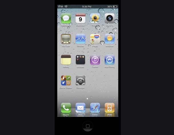
Run iOS 4 on a Modern iPhone with OldOS

Do you long for the days of the skeuomorphic designs and tactile beauty of iOS 4? Do you wish you could run iOS 4 on your shiny new iPhone 12 Pro? Of course you do!
If you’re feeling that iOS 4 nostalgia, you won’t want to miss OldOS.
OldOS is basically iOS 4 recreated as an app, and it’s quite an impressive feat. Because of the nature of OldOS, you won’t be able to get it from the App Store, but you can download the OldOS app through TestFlight, or side-load it with Xcode by downloading the source from the projects Github repository.
If you want to try this out yourself, the easiest way to do so is to get TestFlight from the App Store, then use the TestFlight slot links below to join the OldOS beta testing program, which will place the OldOS app onto your iPhone home screen.
OldOS TestFlight links
OldOS is very popular already so don’t be surprised if you find the beta slots are full. Fortunately the developer has offered a second group of slots, so be sure to try both links once you have TestFlight on your iPhone:
OldOS is highly functional for being an entire OS recreated as an app, but not everything is working (yet anyway, it is beta after all). For example, while Music and Weather works, the Messages app does not, but that doesn’t mean you can’t have a good time playing around with the whole thing.
For now OldOS aims to recreate the iOS 4 experience on iPhone, but we certainly hope an OldOS version will debut for iPad too.
If you just want a quick glance at OldOS without running it yourself, the embedded Tweet via the developer includes a brief video showing off the project:
Today is Launch Day 🚀
Introducing OldOS — iOS 4 beautifully rebuilt in SwiftUI.
* 🎨 Designed to be as close to pixel-perfect as possible.
*📱 Fully functional, perhaps even usable as a second OS.
* 🗺️ Fully open source for all to learn, modify, and build on. pic.twitter.com/K0JOE2fEKM— Zane (@zzanehip) June 9, 2021
OldOS is yet another fun retro computing utility to geek out on, so if you’re into that kind of thing don’t miss this cool project.
Do you remember just how shockingly different the visual comparison was between iOS 7 and iOS 6? Years later, we’re still rocking iterations of what debuted with iOS 7, and nobody thinks twice about it anymore, but it was a major visual overhaul. Now running something like OldOS is perhaps just as jarring visually as that initial change, but there’s no denying it’s still beautiful, even if it’s a bit dated looking.


I wish the iOS 6 UI was an option in Accessibility for people like my mother who have difficulty determining what are really buttons, what are tabs, etc. She has the worst time visually sorting out overly light flat planes of color.
Ditto with MacOS. I recently updated her MacBook Air to Big Sur and I don’t even like the eye pain *I* get from looking at harsher white windows & tinier, greyer fonts. I tried to adjust them for her but it’s like a choice between too bright & painful to super ugly, with no reasonable middle area.
I feel for your mom, mine also has a hard time, especially with all the changes.
The only way to run modern macOS or iOS without getting a tan from the screen is with dark mode.
Thank you.
The worst is when she becomes frustrated and randomly jabs at her iPhone screen.
I don’t think Apple meant for that sort of user experience.
I agree, I also find the glaring brightness and guesswork of the new UI design to be hard to look at, and I have seen many people not know what are buttons when they all just look like text.
You can enable button shapes on iOS and ‘darker colors’ which helps a bit via Accessibility
On the Mac, in Accessibility you can enable High Contrast, which stops transparent flair, but looks uniquely horrible in its own way, though it does make the buttons easier to determine and the text easier to read.
The UI/UX trend to obfuscate elements and prefer high fashion spec-design over function and beauty is really dreadful, it’s a trend that can’t end soon enough if you want my opinion. Make interfaces obvious again.
So much this 👆!
I love retro-computing! Once upon (10 years ago) a time I ran MS Word 5.5 via a DOS emulator on my iPod Touch just because I could. This was way before Microsoft had 0365 on iOS. Ah, good times!
https://abeckstrom.wordpress.com/2011/01/28/microsoft-word-on-the-iphone-for-free/