Hide the Display Notch on MacBook Pro & Air with TopNotch

The all new MacBook Air with M2 and MacBook Pro 14″ and 16″ with M1 Pro and M1 Max processors are impressive machines by most hardware standards, but not everyone is impressed with the Notch that takes up a portion at the top of the screen. The Notch holds the front facing camera, and dips down into the top of the display. So, what if you hate the way the notch looks? Are you stuck with it? Not entirely.
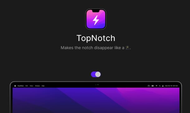
Fortunately for notch haters, there’s an app called TopNotch that hides the display notch, using a simple but ingenious method of turning the menu bar black to match the notch. This effectively makes The Notch blend into the menu bar, making it much more subtle.
TopNotch is completely free to download and runs quietly in the background, and updates itself when the wallpaper changes. It even adjusts with Dynamic Desktops if you’re using those.
Just run the app and your display notch will fall into the black menubar, serving as camouflage of sorts.
Here’s how your menubar and Notch will look with TopNotch running, where it is quite hidden:

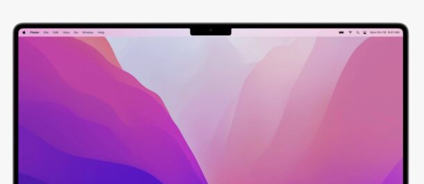
And here’s how the menubar and Notch looks by default, which is quite visible:

This app is ingenious enough that it kind of makes you wonder why Apple didn’t make the menubar completely black again to hide The Notch, but for now the menubar remains transparent (for some MacOS history, the menubar was once black as a prequel to full dark mode). But then again, similar apps and notch hiding wallpapers existed for the notch model iPhone, before most people just gave up and got used to it.
The display Notch, which is a bit of an eyesore, will likely fade to being irrelevant for most users as they get accustomed to the new MacBook Pro, similar to how users adjusted to the notch on newer iPhone models. It’s pretty clear at this point that The Notch has become a bit of a hallmark of modern Apple design, and there are even rumors that it will be included with future redesigned MacBook computers too. So if you hate The Notch, it’s time to get comfortable with it, it’s clearly going to be around a while.

Are you hiding The Notch on your new MacBook Air/Pro with TopNotch? Do you not care about The Notch? Do you love it? Do you hate it? Let us know your thoughts and opinions in the comments.


welp, that killed iStat menus :(
Agreed, notch is terrible. When Jobs was in charge everything had an easeful simplified zen-like quality. Now Apple is ornamental, even gimmicky (Dynamic island?). I waited for touchbar to go away, waited for butterfly keyboard to go away, and someday I presume this notch thing will go away… and we’ll be back to the minimalist design that had made Apple so great. Then I can finally replace this tired 2013 macbook (which I would have done ages ago).
I was seriously considering buying a M2 Pro when they come out but this notch thing is so horrible I am seriously considering alternatives.. and I’ve been excited about M1/M2 ever since they came out.. sad to see such a terrible design :(
Agreed, notch is terrible. When Jobs was in charge everything had an easeful simplified zen-like quality. Now Apple is ornamental, even gimmicky (Dynamic island?). I waited for touchbar to go away, waited for butterfly keyboard to go away, and someday I presume this notch thing will go away… and we’ll be back to the minimalist design that had made Apple so great. Then I can finally replace this tired 2013 macbook (which I would have done ages ago).
couldn’t care less!
I have been using the show/hide feature on the menu bar for along time. Now that I have a new macbook air w/notch I can’t utilize the entire screen space. With the menu bar hidden if I try to place a window at the top of the screen it defaults down to below the notch. I don’t even care if the notch hides some of top of the page of the different apps. For the most part ind apps have their own top menu bar anyway. So, I feel like I have lost screen real estate or am being forced to get used to the – what I consider anyway – visual clutter of an always there top menu strip.
Other than that this new M2 Air is a beauty.
Just here to add to the people saying they hate the notch. I hate the notch. With a passion. It’s the worst thing apple has ever done and I think we’re gonna look back in history and wonder what in the heck apple was thinking. Other than…well this way we’ll have something to “upgrade” when we GET RID OF THE NOTCH!!! Woo Hoo! Best company ever! They got rid of something no one else ever had to begin with!
I have a pathological hatred the notch on iPhones and Macs (where menu bar items get hidden behind it!) I am still amazed that people have accepted an intrusion on a screen (would you on a TV?) and infuriated that, because of this, Apple have now adopted it as a ‘trademark’.
My phone(s) are the 8 and 8 plus as they were the last without a notch. I bought the 2021 MacBook Pro Max and hoped I could live with it. I couldn’t. But then I downloaded ‘Topnotch’ and now I can use my MacBook without swearing at it. I know I am an extreme example but I just hate it that a company renowned for beauty and elegance has decided to to go with such a moronic and jarring design emblem.
Apple should pay the designers of ‘Topnotch’ a commission!
The notch is dumb as can be. Plenty of PC laptops and Android phones don’t have one, it’s a very weird ugly vanity thing.
Or you can just use black wallpaper. That’s what I do. I don’t care about the notch anyway. I don’t care about having one on my iPhone either.
I find the notch to be a deal breaker
Notch-hater here, what *really annoys me about the notch, is that i can move and hide my mouse curser behind it, which is idiotic. Apple makes every bit of this machine, yet it baffles me that they think it’s perfectly fine for the OS to behave as if it’s not even there, similar to as if I were to simply put a piece of tape on my screen…
Agree completely. I do not like the Notch and I am so disappointed they put it on the MacBook Air (and no fans either? Ugh how do we work outside in the sun with that thing?)
My guess: Apple wants to push the shape of screens with notch so people can instantly tell apart their products from the others.
From this point of view, easy ways to hide the notch could hurt their brand
I hate the notch
Instead of complaining about The Notch users should be happy to have the menu bar placed into the area where previously there were bezels
Count me as a notch hater, but not because of the look. I hate it because with the plethora of apps that stick icons into the menubar, the notch seems to get in the way of displaying all the menubar icons. There are just too many to fit in the menubar to the right of the notch. I’ve found a different app (Bartender) to remedy the issue. While it’s not free, it’s worth the cost to have all the menubar icons displayed.
My problem with the notch is it hiding menu items. TopNotch does not help with that.
I don’t have one of the “notched” MacBooks; however, when Apple decided to make the menubar transparent I turned to publicspace.net for _Boring Old Menu Bar_. It has several window related features, but recoloring the menubar is its primary one. Since the “notched” systems arrived the author released _De-Notch-ifier_. It’s basically a pre-configured version of BOMB so it’s not free. Conveniently though, if you buy one the other is free. I have no affiliation with publicspace.net. I do enthusiastically recommend all of their software.
The real issue is that the notch hides menu bar icon/apps if you have more than just a few. Only way to see and use them is to temporarily change the screen resolution. It’s a real pain but Apple has refused to address it.
I don’t understand why some people are so hung up on the “notch.” A black strip that “hides” it may pacify some people, but I’m still puzzled why it’s such a big deal.
Because it is a no go for a computer which is considered to be a professional device. It is a design and usability flaw. It takes a way a part of your screen without any benefit. Destroys the function of the menu bar.