How to Increase Interface Contrast in macOS Monterey, Big Sur, Catalina, Mojave, Sierra, El Capitan, Yosemite
The revised interface in modern MacOS versions including macOS Monterey, macOS Big Sur, MacOS Catalina, macOS Mojave, High Sierra, Sierra, OS X El Capitan, and OS X Yosemite makes heavy use of transparencies, flatness, white space, smaller and narrow fonts, and a dramatic lack of contrast with neutral shades of grey used for most text and many onscreen elements. Combined with the new system font choice of San Francisco or Helvetica Neue (the same font from iOS), the overall look of modern Mac OS is beautifully fancy on Macs with Retina displays, but the ensemble doesn’t always look so great on Macs with normal screens, where the thinness and lack of contrast just ends up looking blurry. Additionally, some users find the Mac interfaces lack of contrast to be challenging to read and interpret.
If you find the newly redesigned interface of MacOS from OS X Yosemite onward to be challenging to read or use, lacking distinction between onscreen elements, or just otherwise distracting, there is a settings choice that improves usability significantly. The result is greatly improved contrast in the user interface, it’s a little retro System 7-ish (for those longtime Mac users this could be a good thing), but the improvements to readability and distinction of interface elements make that a worthwhile endeavor for some users who find the newer interface style to be difficult otherwise. As already mentioned, this is really most useful for users without Retina displays since that’s typically where Yosemite doesn’t look as refined, though of course users with a retina Mac may find the enhanced contrast feature to be an improvement as well.
How to Increase Contrast of Screen Text, UI Elements, & Disable Transparent Effects on Mac
Note that by increasing the contrast you will also disable the translucent screen effects from menu bars and windows.
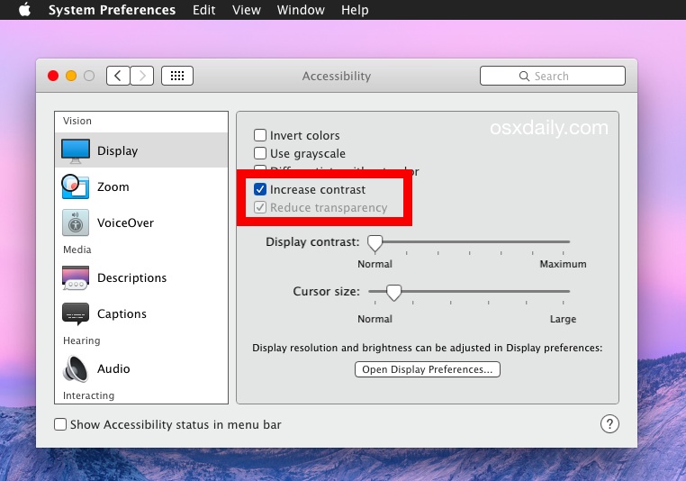
- Go to the Apple menu and choose System Preferences
- Click on “Accessibility” and select the ‘Display’ panel to the left
- Check the box for “Increase Contrast” (this automatically reduces the transparent effects too)
- Exit out of System Preferences as usual

The effect is instantaneous and fairly dramatic. Most onscreen buttons and user interface elements are suddenly outlined in a dark grey border, and the system font is transformed from the challenging light grey to a darker shade of grey with much greater contrast against its background.
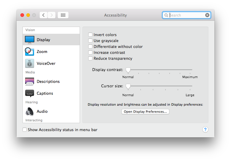
Here’s what the default contrast level looks like in the Accessibility preference panel of Mac OS :
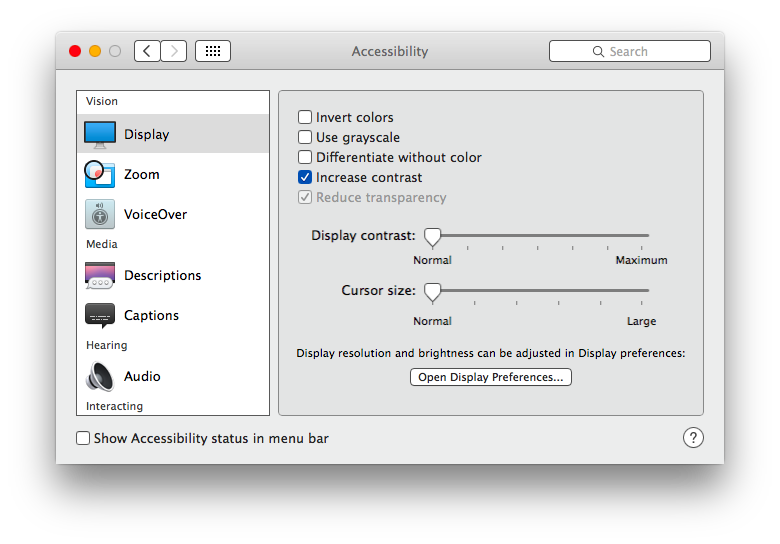
And here’s what the “increased contrast” option looks like in the same preference panel:
Other user interface elements in MacOS and Mac OS X change quite a bit too. Here’s what the Finder and menu bars look like with the default contrast setting:
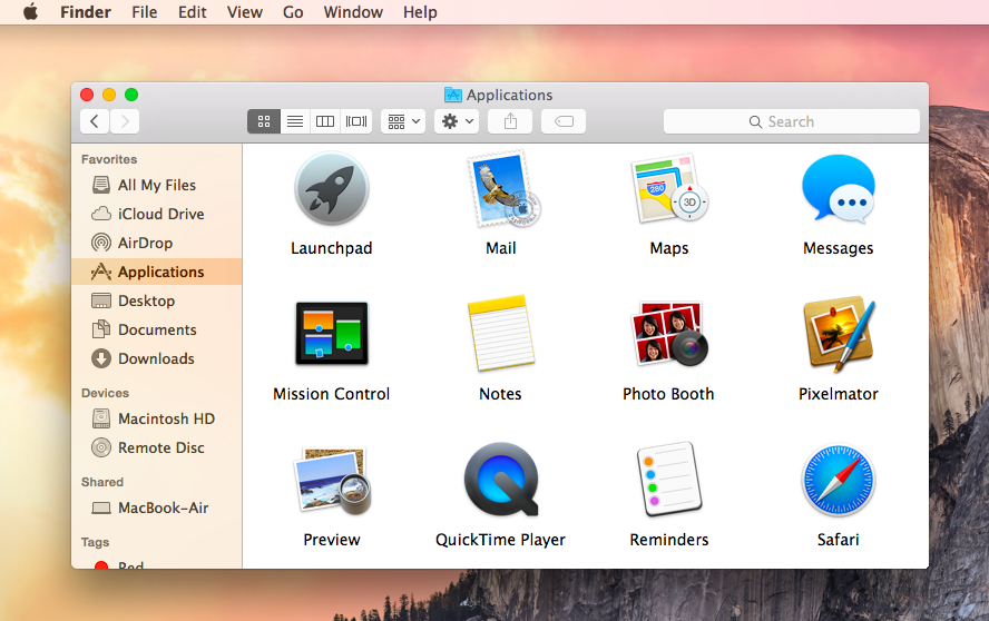
And here’s what the same desktop shot of the Mac looks like in Yosemite after the Increased Contrast option is enabled, notice the fonts are darker, sharper, the menu bar is no longer transparent, and the Finder window translucency is turned off:
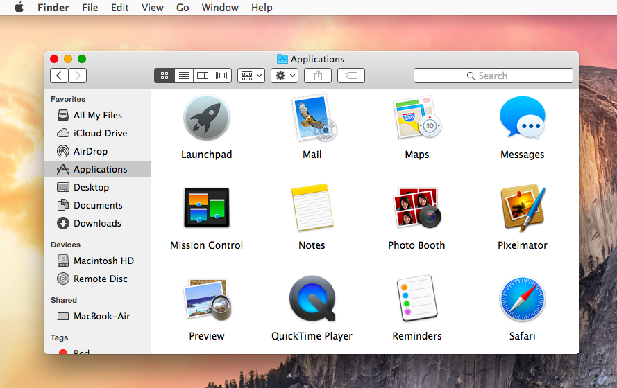
As mentioned, this also disables all the transparent stuff elsewhere in the menu bars and windows, which further adds to an overall boost in differentiating elements in the user interface of Yosemite. Whether or not you think this is better or worse likely depends on your display type, your eyesight, and personal preferences.
For some users, these seemingly minor user interface changes can be a significant distraction, and potential difficulty reading the newly thinned fonts was one of the primary reasons we cited that some users may want to avoid the Yosemite (or more modern) upgrade entirely. If you’re still not satisfied with the way things look in Mac OS X Yosemite after using the Accessibility options, you can always downgrade back to OS X Mavericks, though that may be a bit extreme for many. Of course all modern macOS releases look this way too, though Sierra and Catalina retained a bit darker of a interface than Monterey and Big Sur which is back to the bright white appearance style of Yosemite.
Remember, you can also submit feedback about Mac OS X directly to Apple using this online form on their website.


Is there anything that Tim Cook has shepereded through that hasn’t stunk?
This guy diverts hundreds of millions to SJW BS and multi multi emojis and meanwhile the OS just keeps getting worse and worse, and the basic business apps like Mail, Contacts and and Calendar are weaker than from the 90’s.
Just upgraded to El Capitain 10.11.1 (wotta nightmare). My biggest beef if the calendar icon on the dock previously (10.7.5) clearly and boldly showed the date. With this new font, the numbers are thin and reedy and if you have minimized a bunch of stuff the icon gets so small the numbers become illegible.
Any way to get the previous calendar back? Overall my VPN connection is much more stable so I am inclined to stay with El Capitain.
This just worked for me.
Keep a window or image open so you can judge the adjustments. Then go into;
System preferences
>Color
>Calibrate
>Expert Mode
>Continue
Enter through the instructions and choices that will decrease or increase gamma (brightness/contrast) to suit your own preference, and save under a new display profile name.
It might take a couple of attempts to get it exactly how you like it, but the great thing is you’ll be able to compare it to your original display profiles and the profile you’ve already created.
ugly and unusable! nothing more to say about it except the only way to save your mac is to back to maverickS (which is a hassle but well worth it!) Hope the next OS X will be normal again :)
I’m relatively new to Apple products. My daughter gave me her old MacBook Pro with OS 10.6.8. In the last 2 or 3 weeks, I have had troubles with the contrast & the colors. I went into the system pref display to see what my laptop was set on. There were 6 different profiles to choose from & I could not see what it was set on, so I chose Color LCD. The other profiles are almost the same.The contrast is not here anymore. The highlighting, boxes to type in & other things I would like to see are not visible. Could an update, done about the same time I started having visibility trouble, caused this problem? I am going to try some of the things other people did on Yosemite.
Just reported the text as a bug to apple. Can’t read anything with 24″ monitor. My eyesight is excellent. Their user interface and fonts are not.
Luckily, I no longer trust apple, so I installed yosemite on a partition to test it before committing. Sure glad I did that. There’s lots of other bugs that I found too. So, back to mavericks! Better the bugs you know… Hopefully we never need to upgrade to yosemite until this is fixed. Somehow I doubt that they will fix it.
I have reported the font in OS X Yosemite as a bug probably 10 times, the font used in OS X Yosemite is terrible. Too small, too tightly spaced, and the color needs to be black. I started reporting it in the public beta and here we are at OS X 10.10.2 with no change, so they must think having illegible fonts are a good idea.
I noticed that when “Increase Contrast” is used in version 10.10.1 with the “Use dark menu bar and Dock” option on, the typed text in the Spotlight Search field is black instead of white on a dark gray background, and is almost impossible to read. If however the dark option is not used, the contrast option does not change the color of the text (black on light gray).
It seems that Apple has some more work to do on this.
Indeed that is one of many bugs with the dreadful OS X Yosemite appearance. It’s not even usable without Increase Contrast because the fonts are so light and, well, lacking contrast, but wow is it ugly and incomplete with Increase Contrast. So you can have a feature (light grey text on lighter grey window title bars in size 10 ultra thin font) or you can have a bug (black text on light grey with Dark Mode), pick whichever one you want they’re both awful. And don’t even get me started on the drop down menus or the system font in general.
OS X is now total amateur hour, and a terrible user interface experience.
After installing Yosemite on my MacBook Pro, I thought I had accidentally reverted to OS7! Really, Apple?
I want the beauty of Snow Leopard back!
Seconding ThomBob!! What the hell happened? Really guys???
To Increase the Size of Screen Text
1. Go to the Apple menu
2. Choose System Preferences
3. Click on “Accessibility”
4. Select the ‘Display’ panel to the left
5. Select “Open Display Preferences” and choose ‘Scaled’, then select the best resolution for your viewing pleasure.
Example: My default resolution was 1920 x 1080 but the font was so small and hard to read. When I changed it to 1600 x 900 it made it much easier. Hope this works for you, too, without having to change your OS.
That changes the display resolution, which is not appropriate for LCD and LED displays that are not retina. Straying from the native resolution on a non-retina display or non-CRT results in a very blurry appearance from pixel doubling. This is not an acceptable method of making onscreen items bigger, the text size and antialiasing itself needs to be be changeable at the OS level allowing for full native resolution.
It all looks great to me, whether on my 13″ Air or my 27″ Retina iMac. I see no readability issues with the font on my non-Retina Air. Guess I just don’t have anything to whine about.
Yosemite is beyond any norm of aesthetics.
It has no style at all, it’s unfunctional, contra-productive.
Every single detail of the GUI needs a lot of refinement (we have retina displays!).
“Let’s go flat” is a very poor excuse for this sloppy design work.
I just got myself a brand-new Retina MacBook Pro with Mavericks on it.
I find it unbelievable that such top notch hardware is now being loaded with the new 10.10 Fisher Price look.
I’ll stick to Mavericks as long as I possibly can.
Looking at the first screenshot in the article OSX Yosemite reminds me of the old early releases of OSX (pre 2000).
How can this be an improvement over anything, I’m baffled.
By far this is the worst thing apple has done after IOS7… I just hope they realise how badly they are ruining the interface soon… Im back on Mavericks cannot stand this crap..
Thank you!
Or one can revert back to Mavericks :->
Hi Paul,
Your screen shots show the close, minimize, hide buttons in colour.
Ever since I insatlle Yosemity they have gone to a very dark gray. The “+” and other symbols are not visible till I mouse over the button. Thisis utter nonsense! All Mac user know after one day of using a Mac what these buttons do. After day one, the colour was a clue to hit the correct button in a flash. Now this is a bit slower.
How can I get mine close button to be in colour again?
Yosemite can now be used in interface design classes as an example of “form over function”.
Is there no fuctionality watchdog at Apple. I can’t imagine that such a function does not exist, but it appears he or she is being ignored.
You can get the color close / maximize / minimize buttons back by going to System Preferences > General > Appearance > “Blue”
is Lucida Grande font on screenshot? How change Helvetica?
Yes that is Lucida Grande hacked into Yosemite, it’s a must if you want to actually read anything.
It looks like Display contrast works backwards.
Yosemite is sooo ugly. Did the “reduce transparency” myself 5 minutes after installing Yosemite. And then I had to laugh because the small windows for making sound louder or less loud now have ugly black edges. As if the mask was missing.
Yea it looks like they forgot to make the sound and brightness controls use a transparent PNG or something. Attention to detail is very poor in Yosemite. Let’s hope 10.10.1 and 10.10.2 fix a lot of this UX/UI crud.
Use cdock (free) to modify the dock. That’s the best way to get the dock look usable.
Thanks Hemmo, cdock worked.
It makes the dock look like crap though. I wish there was some way to decrease the excessive whiteness of Yosemite.
One possible solution for you is to use Dark Mode. The dock will be black, instead of white.
Will this change how iTunes 12 displays?
Great tips, but how did you bring back Lucida for the main system font? It can be seen on your examples screenshots.
Don’t get me wrong I’m a fan of Helvetica, but I think it just doesn’t work for menus. Maybe I’m not used to it yet, but I’m interested in how you did that. Thank you!
There’s a tool to replace Horrible Helvetica Neue with Lucida Grande as the system font, I think the few who are aware of it are hoarding it in the hopes that Apple doesn’t release some patch that prevents the usage of that font replacement tool.
ok then I hope I’ll find it. Thanks for the reply
found! yay! Menus can now be readable instead of just beautiful
I used the Lucida Grande patch, it helps a lot in making Yosemite tolerable.
If Apple prevents the Lucida Grande hack, I’ll never update OS X again.
My eyes are dying, need help with my fonts/display please??! Also using Macbook Air early 2014 model :(((((
This reminds me of when the new iOS interface came out and it was so hard to read that they had to walk back with the next .1 release with Bold Fonts and Contrast options.
Perhaps OS X 10.10.1 or OS X 10.10.2 will have something similar to remedy the UX issues with font size and font weight.
I wish you could apply Increase Contrast to the fonts only, and that you could make the font size BIGGER because it’s so tiny and thin it’s hard to read. Using it anyway, but we need more help with the interface.
Can you imagine someone having vision difficulties trying to use OS X Yosemite? My eye sight is pretty good and it’s tough.
User response to the Yosemite font and interface seems to depend on screen size and screen type, a Retina display looks good, and a 22″ screen looks good. But the non-retina 13″ or 11″ MacBook series, it does not look so good.
I have a MacBook Pro 17″ 2011 and it’s terrible, it hurts my eyes so muchI’m going back to Maverick. There are so many good things in Yosemite, but it’s not worth the pain.
I have had the same experience as you, the text and font and light grey on grey everything strains my eyes and I’ve never experienced this on any computer before. Isn’t the point of an operating system to enable productivity and get out of the way? OS X Yosemite is an impediment on my workflow, there is no way we are alone here. I tried the Contrast thing and sure it helps, but it’s still fuzzy fonts everywhere.
By the way, I have good vision, but Yosemite text is so small and so blurry it makes me feel like I put on someones corrective glasses. Is it really better on a retina screen? I’ll just stick with Mavericks on my Mac for now, I don’t have $3500 to “upgrade” to a retina iMac that may still look blurry.
I highly recommend everyone with problems use Apple forms to make your voice heard about this. Or we can stick with OS X Mavericks forever, I guess.
I think the font and general UI tolerance depends on screen size more than Retina or Non-Retina display.
Yosemite looks good on a 24″ screen, but wow it looks awful on the MacBook Air screen.
Overall I think it’s too white and bright, and lacking contrast. The Increase Contrast option helps, but it is still not good. Things look blurry, washed out, overexposed, and hard to distinguish. Yosemite UI gets in the way of work rather than out of the way an OS should.
Stay on Mavericks, people.
One possible solution for you is to use Dark Mode. The black menu bar makes the white text very easy to read.
I did what the writer suggested and it worked perfectly!!! I use a MacBook Air 13″. Without those changes using my laptop was nearly impossible.