iOS 10: Finding Music Controls at Control Center

Apple redesigned some fundamental features with iOS 10 on iPhone and iPad, including where the music controls are found in Control Center, slide-to-unlock, and the newly hidden Shuffle and Repeat controls in Music app itself.
If you’re new to iOS 10 and thought that Control Center removed the music controls, it’s likely because the new way to access play, pause, skip, and adjust volume is easily overlooked. Not to worry, accessing Music from Control Center is really easy once you learn where to look!
Access Music in Control Center for iOS 10 in 2 Easy Steps
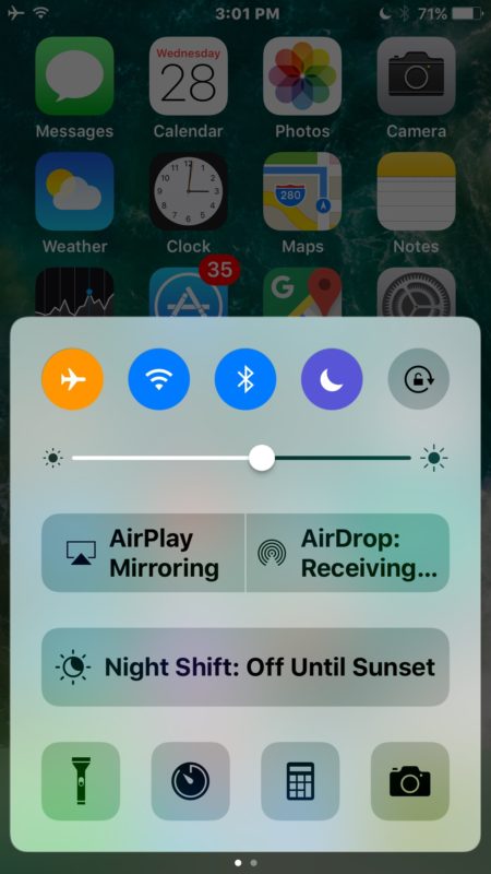
- Swipe up from the bottom of the screen on an iPhone, iPad, or iPod touch with iOS 10, this will bring up Control Center as usual
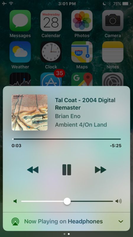
- Now Swipe over to the left on Control Center to reveal the Music control section


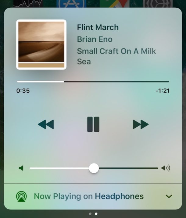
As you’ll see, Music now has it’s own dedicated screen panel in Control Center for iOS 10 and is no longer part of the initial control center screen. You’ll find all the typical Music controls in this Control Center panel, including the album art, song and artist name, a timeline, back, play / pause, skip, volume controls, and a toggle to adjust audio output from Headphones / AUX (if you’re using the adapter dongle with iPhone 7) / Wireless to other audio sources.
While this may seem a little confusing at first for users who are accustomed to quickly accessing Control Center Music in a single swipe gesture, it’s an easy habit to adjust. Just remember to swipe up, then swipe over to see Music in Control Center.
Interestingly, I have found that several friends and family have had difficulty with this change and initially thought Music was removed from Control Center in iOS 10 on iPhone in particular. For what it’s worth, the first time a user sets up iOS 10 there is a little walkthrough about Control Center when it is accessed, but it’s easy to skip through those type of screens and rely on old habits.


i use assistive touch music control while playing but when i start to press the play button my music is lost as i want to play music while my screen is lock
Nice post about music controls entire but honestly I prefer older iOS version when it comes to reliability and user interference of lock screen and many other changes from iOS 9 to iOS 10 as one has to scroll twice to control in control centre and lock screen sucks too. Press home button to unlock feature is another crappy thing and iOS 10 is actually quite buggy too. But added lyrics screen in music player is a quite good thing. Keep writing more great stuffs about iOS tweaks and tips.
Ok, but how about random playing?
If you select a song I did not find any way to have an automatic shuffle without pressing casual playing
Taking away the swipe to unlock makes the user push a mechanical button. The button will surely fail faster with this change. Hmmm… ya suppose they want our devices to fail sooner with the intent we will replace them sooner? Bummer Apple.
They removed the create genius list in Music. Bad change for those of us who need to download some of our cloud music every now and then as storage is limited. Bummer Apple.
Not a happy camper at all.
They won’t get me to destroy my home button, I use AssistiveTouch as home button now! … Maybe *that* was their intent all along, get people to finally use their Accessibility features. :p
But yeah, I’m not happy with most of the changes either. Ugly too.
If Apple didn’t have a “Music” product I would be convinced they were trying to get people to not listen to or enjoy music at all anymore. Hiding Music in control center behind a secondary menu? Hiding playlists? Hiding buttons in Music app? Using enormous fonts that cloud the UI in Music app? The terrible Apple Music subscription service? The weirdness of iCloud Music that nobody can understand or explain and why it is different from Apple Music? The worsening of iTunes, what was already the worst software created by Apple, now made even worse by hamfisting the Apple Music service into it?
Does Apple actually use this stuff or do they all just use Spotify now? iOS 10 is a world of confusion and clutter. It feels like the essence of design by committee. And the Music situation is just….. amazingly bad. They know it’s bad, which is why they redesign it every time, but it gets worse. Here’s an idea, roll back to Music in iOS 6! Then have a separate Music app for the streaming cloud nonsense!
In many ways this is an improvement. You only have to do the swipe up for Control Center, then swipe across for the Music controls the first time you use Control Center. From then on it remains on the Music controls page.
Denon has a great music app for the iPhone, with actual equalization.
Also, you forgot about getting rid of the earphone jack thereby rendering the 7 useless on existing home stereos, most cars with jacks, the three studios where I teach yoga …