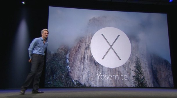
OS X Yosemite is the Next Mac OS: Here’s a First Look
OS X Yosemite is the next major release of the Mac operating system. It’s set to be a whopper of an update for the Mac, with a major new user interface overhaul and a slew of amazing features. Let’s take a quick look based on what we’ve seen so from the OS X Yosemite presentation at WWDC 2014.
(We’ll post a better screenshot walkthrough later, but in the meantime the below images were captured from the WWDC 2014 lifestream)
Update: here’s a screen shot gallery of OS X Yosemite pictures.
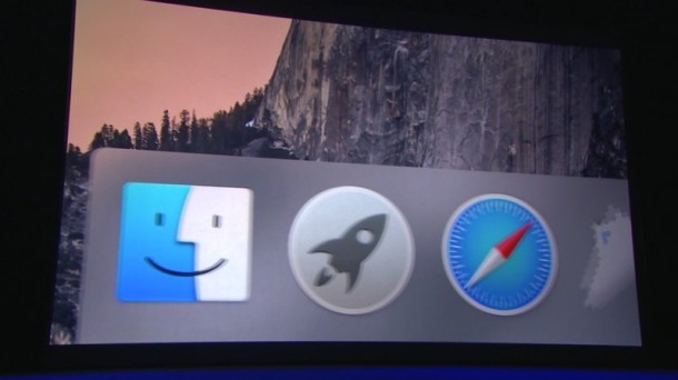
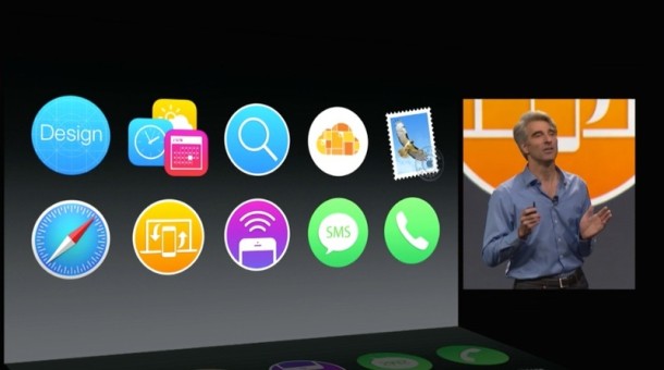
All New Interface
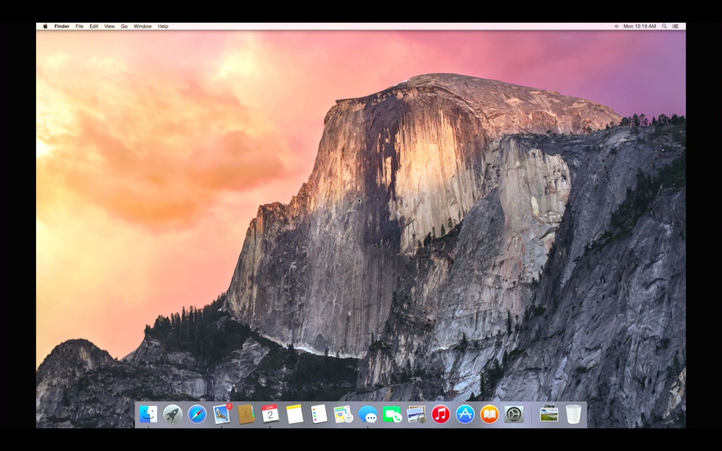
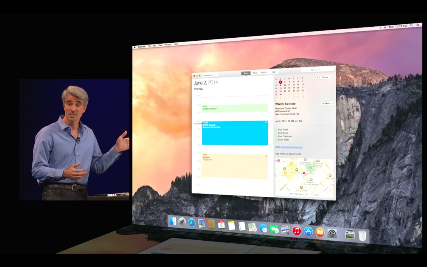
New fonts, new icons, an all new look. You’ll find translucent finder windows, a flat and gorgeous UI redesign, a new Dock appearance. This is very much like the iOS UI coming to the Mac, but arguably it looks better.
The interface is very white by default… but, if you’re not into that, there’s also a “Pro” mode, which has a dark interface that transforms into a dark grey UI rather than the bright whites of the default appearance.
First Look at a Few OS X Yosemite Features
There are tons of new features in OS X Yosemite, here are a few brief highlights of the more interesting features discussed today at WWDC:
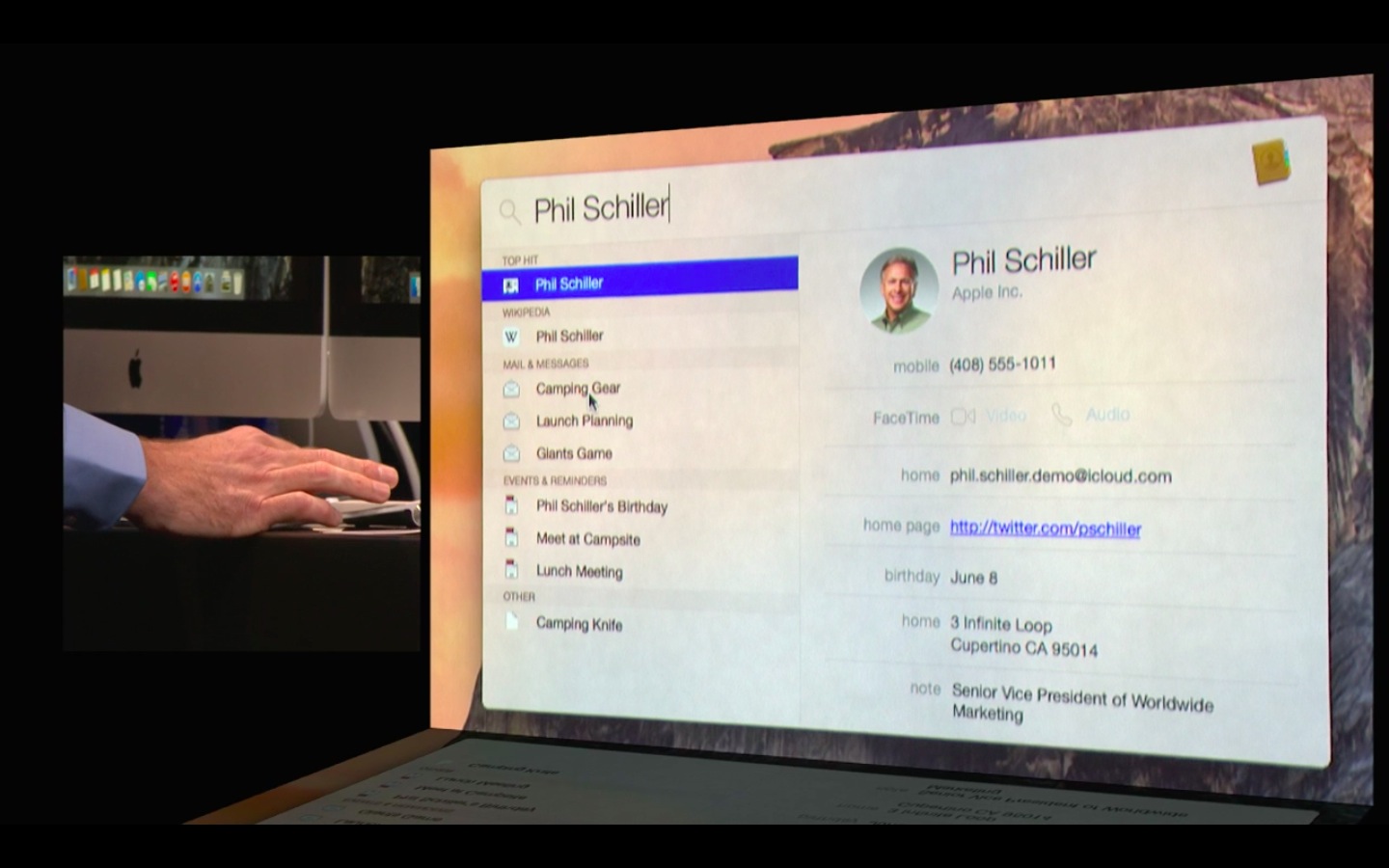
All new Spotlight – Hovers over the screen and functions as search engine for files, information, contacts, restaurants, and so much more.
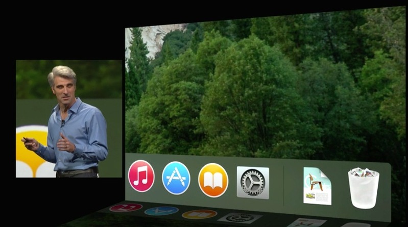
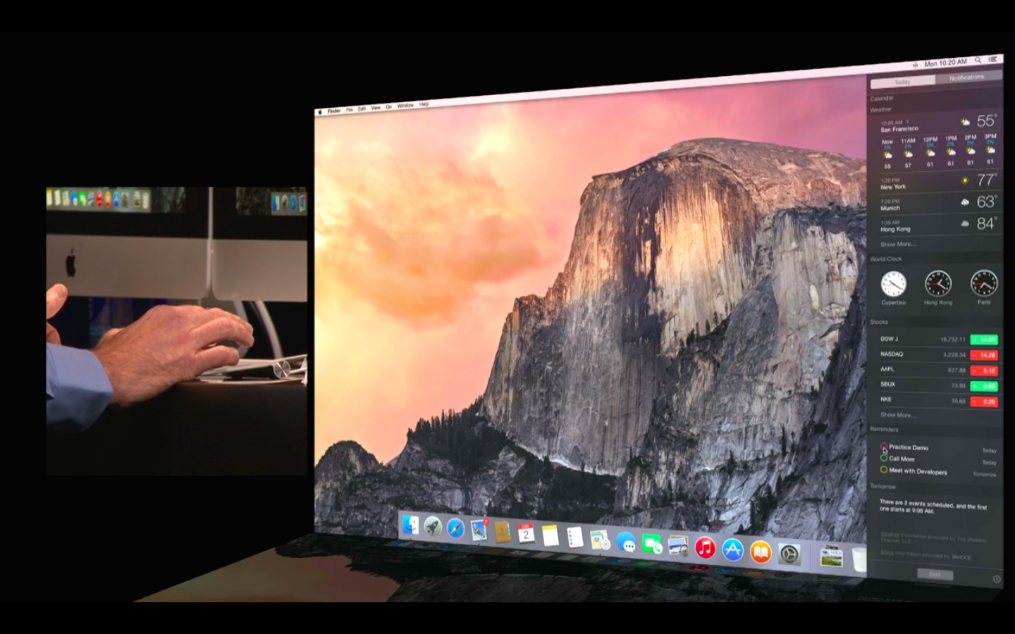
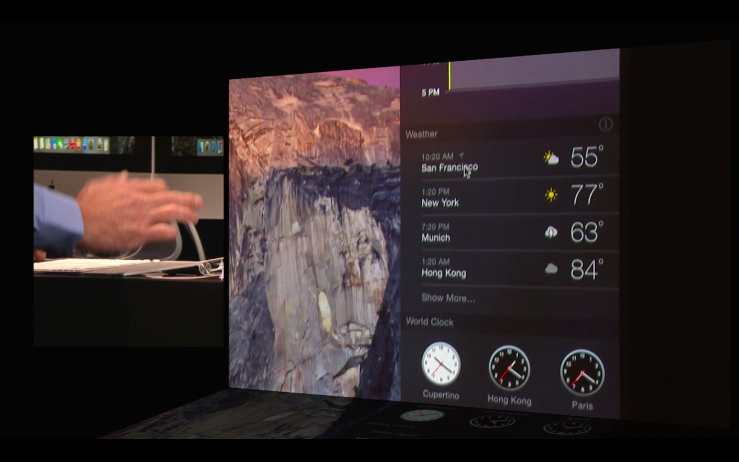
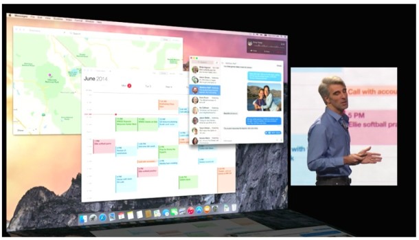
All New Notification Center – Slides out from the sidebar, and looks very similar to iOS. New widget support allows third party widgets to be added to Notification Center.
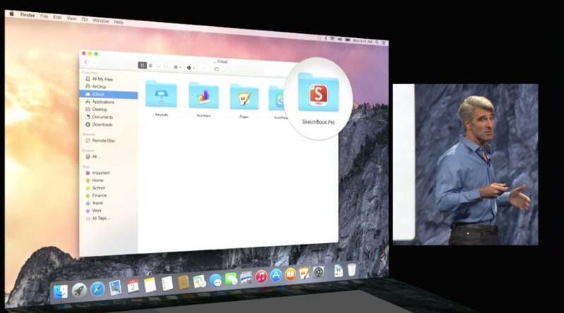
iCloud Drive – iCloud (finally) gets a direct Finder interface with drag and drop support, folders, tags, and across-Mac syncing. Documents also sync to iOS, and even Windows (!).
Mail Drop – Want to send someone an enormous document? Instead of bouncing off the mail server due to size limitations, Mail Drop allows users to encrypt documents in the cloud and email downloadable links for files that are up to 5GB in size. For sending to iOS and OS X, the file(s) download automatically and feel seamless, whereas other clients will get ad download link.
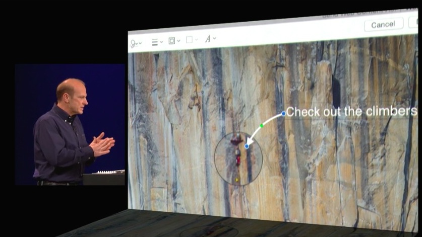
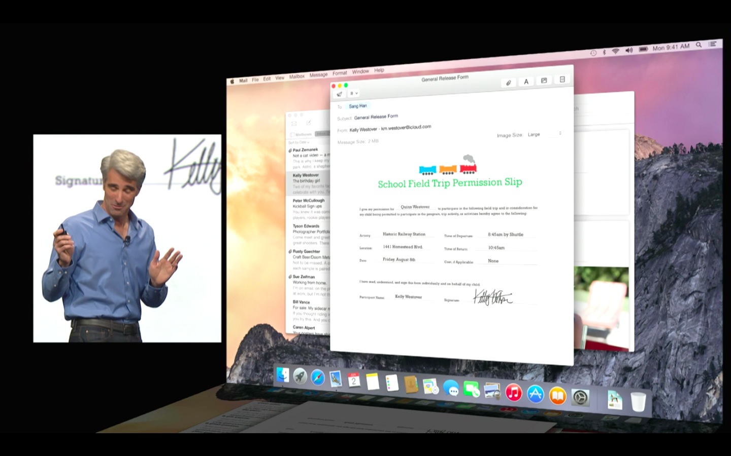
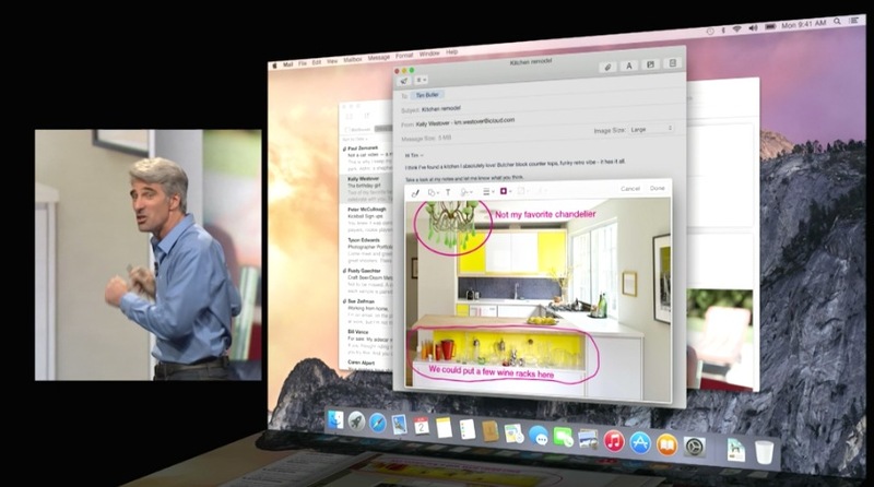
Markup – Built into OS X Yosemite is the ability to doodle, draw, and markup directly on screen and in emails. Handy!
Safari – Revamped UI, native RSS subscriptions built directly into the Reader view, and a new tab browsing view similar to iOS Safari.
AirDrop – Full iOS to Mac support, for direct file sharing between any Mac or iOS device.
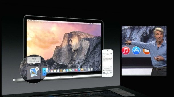
Handoff – You can now ‘handoff’ application activity to iOS or OS X when in proximity to a device. For example, you can start writing an email on your iPhone, then hand it off to Mail app on your Mac when you get to the computer. And vice versa, of course. This should be a huge productivity boost.
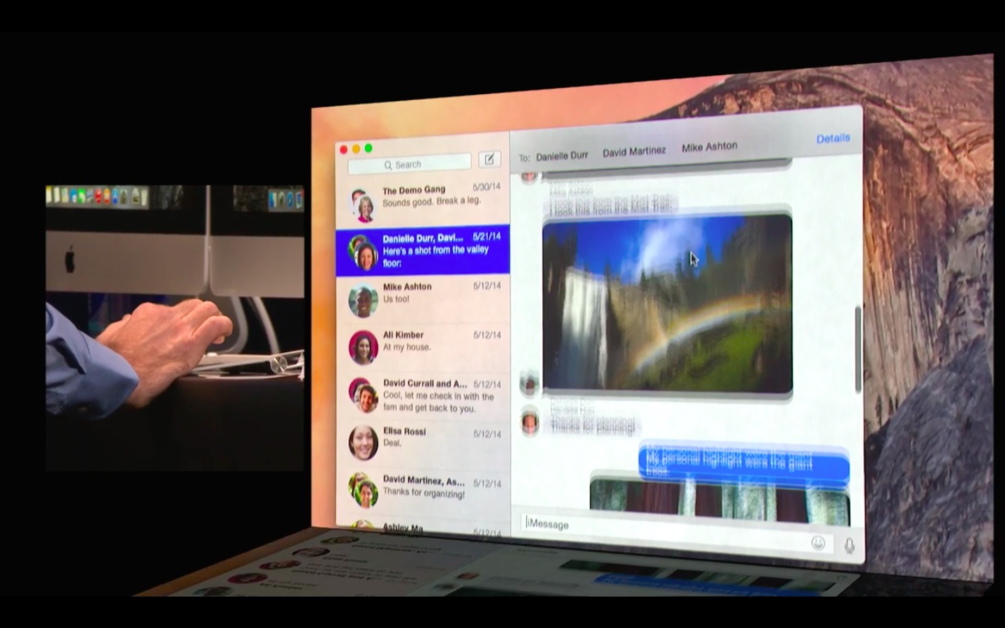
Messages – SMS support relays text messages from the Mac through the iPhone, sounds convenient.
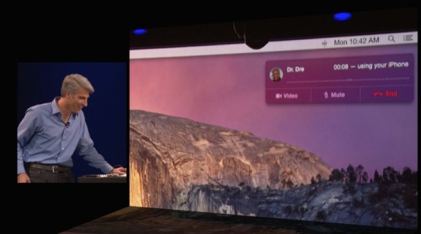
Mac Phone Call Support – The Mac can now make and receive phone calls through an iPhone, complete with caller ID. This relays phone calls from iPhone to the Mac, as long as they are in general proximity to one another.
OS X Yosemite First Look Pictures
These are all snapshots from WWDC 2014, better resolution images of OS X Yosemite will be available later.
Note the images below were captured from the WWDC 2014 life stream, a a higher resolution gallery of screen shots featuring OS X Yosemite pictures can be found here.


(Thanks to MacRumors Live Stream for a few of the additional WWDC image captures)

No, after a while you will switch from Yosemite to Mavericks. It’s not “beautiful” – it’s almost as ugly as iOS8. I’m amazed and appalled at how disgusting it is.
Also, after a while you’ll like Yosemite. It’s beautiful 😍
Yosemite does NOT feature “translucent finder windows”.
Actually OS X Yosemite does feature translucent Finder windows. The title and sidebar are both transparent, perhaps you have that setting disabled.
I can not believe OSX 10.10 is an Apple product… Are Apple’s staff crazy?
The ugliest OSX ever .
I can’t agree, Windows H8 has it beat there. But not by much.
To be honest, I can’t believe why Apple build such kind of crap. I never ever thought that OS X desktop could look uglier than Windows and all those funny Linux trials. Yosemite looks like: “from kids for kids”. I will stay with Mavericks as long as possible. And yes, I miss Steve Jobs – if he could see the 10.10 desktop as Apples greatest step backward he would be very very sad. In fact the Microsoft development would be happy with this Apple crap, Yosemite seems to be a great chance for them to close the gap without doing nothing else than laughing loudly about the childish Apple work.
I’ve installed the Yosemite beta on VMWare and why is it that Apple always has to take one step forward, two steps backwards. THIS UI IS ABSOLUTELY FLAT UGLY CRAP. The blind morons (sorry to insult blind people) who built this ought to be fired. The management ought to be taken to the woodshed. I feel like I am looking at a UI from 1980. What the hell is wrong with the decision makers at Apple who could possibly imagine a flat crap UI is appealing?
Tried the beta. Doesn’t work (font/icon-wise) on non-retina mac. Flat design could be nice but as of now in Yosemite it is ugly. Too much grey in menu bar dropdowns. Buttons (eg. in Finder) look like taped on the windows. Folder icons color is really ugly. New Spotlight window is much too small (should be adjustable in size).
In short: Yosemite looks more like a UI mock up done by an amateur.
Mac used to be an expensive niche computer that was beautiful and elegant. Now it’s an ugly and expensive niche computer that no one wants. It’s obvious the losers of that company conspired to throw out the talent and run it into the ground.
I’m more interested in whether the new OSX version will fix the mess Mavericks made of Finder-it’s been a slow, kludgey mess on my late 2011 Macbook Pro.
Apple seems to have taken away the ability of people to position their docks in the lower corners of their displays. Let’s hope this was just an oversight.
It’s as if they were daring MS to name the next version of their OS ‘Bugs’.
Did they say anything yet about fixing Pages and Numbers? They are *so* weak now…
I downloaded and installed the new Osx 10.10, Yosemite. Apple have head better days than this. The look is gray, flat and feels dead!
+1! Feels dead, indeed.
i’m glad they ditched the 3-d dock. i’ve been disabling that for every version possible.
I don’t agree with you. Because beyond the boundary contours dock icons allows you to visually locate them quickly. Back to Tiger Dock was poor idea.
Yes. Ugly like iOS7.
I hope they add a mode to make it like Mavericks. I really hate having to re-learn how to do things with every new release of an OS.
I CANT BELIEVE THAT APPLE MADE THIS SOOOO UGLY YOSEMITE OS… I WILL NEVER CHANGE TO THAT OS, I WOULD GO TO LINUX RATHER, THAT INSTALL THAT…w
I agree. It’s looks very ugly. I try the beta and on my MacBook Pro 13″ without retina it looks like they don’t pay attention on every detail. Many GUI elements are misaligned. And many icons blurred, the GUI elements just not beautiful.
But I think this is because of my non retina. Looks like on the retina screens it looks much better. I even think they develop new OS on the retina, coz retina is some kind of standard now for Macs notebooks.
Ooo, I’m looking forward to the iCloud Drive addition (as you said, finally!), and am intrigued by Mail Drop and Markup, to see how well those will work.