How to Increase Interface Contrast in macOS Monterey, Big Sur, Catalina, Mojave, Sierra, El Capitan, Yosemite
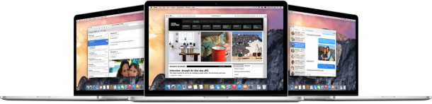
The revised interface in modern MacOS versions including macOS Monterey, macOS Big Sur, MacOS Catalina, macOS Mojave, High Sierra, Sierra, OS X El Capitan, and OS X Yosemite makes heavy use of transparencies, flatness, white space, smaller and narrow fonts, and a dramatic lack of contrast with neutral shades of grey used for most text and many onscreen elements. Combined with the new system font choice of San Francisco or Helvetica Neue (the same font from iOS), the overall look of modern Mac OS is beautifully fancy on Macs with Retina displays, but the ensemble doesn’t always look so great on Macs with normal screens, where the thinness and lack of contrast just ends up looking blurry. Additionally, some users find the Mac interfaces lack of contrast to be challenging to read and interpret.


 iOS 8.1 will be released for compatible iPhone, iPad, and iPod touch devices on Monday, October 20, according to Apple. The update will include new features like Apple Pay, the re-introduction of the Photos app Camera Roll, the ability to interact with Macs running OS X Yosemite, and the update is expected to include many bug fixes and solutions to some of the nuisances that arrived with the initial releases of iOS 8.