Change the Mac System Font to the OS X El Capitan Font in OS X Yosemite
When the San Francisco type face first debuted it was made for the Apple Watch, but some enterprising Mac users modified the San Francisco font to run in OS X Yosemite anyway. Fast forward to now, and the San Francisco font has been revised by Apple to be a bit more readable for the Mac desktop and iOS devices, as it will soon replace Helvetica Neue as the default system font in iOS 9 and OS X El Capitan. That font has been released for specific use by Apple (available here), but if you’re currently running OS X Yosemite, you can use a copy of the modified version of the El Capitan system font right now.
To be perfectly clear, the OS X El Capitan San Francisco system font is different from the Apple Watch variant of San Francisco, which has since been renamed to San Francisco Compact, intended for watchOS. In other words, if you installed the Apple Watch font onto your Mac, it’s not quite the same as the one mentioned here.
Do understand this is an unofficial port of the El Capitan system font made by a user on this MacRumors forum page, and some text may render strange or out of line with odd kerning. Obviously the font won’t look that way in OS X El Capitan, but this particular patched version may look a little strange sometimes throughout OS X Yosemite.
Installing the El Capitan system font as the system font of OS X Yosemite is just a matter of dropping it into the appropriate fonts directory and then rebooting the Mac:
- Download the modified SF font family directly from this link and unzip the archive
- From the Finder, hit Command+Shift+G and enter the path: /Library/Fonts/
- Drop the font files into /Library/Fonts/ (if you have a different set of modified system fonts in this folder remove them first)
- Reboot the Mac to have the change take effect
Uninstalling the El Capitan system font from OS X Yosemite is just a matter of moving those font files back out of /Library/Fonts/ and into a different directory.
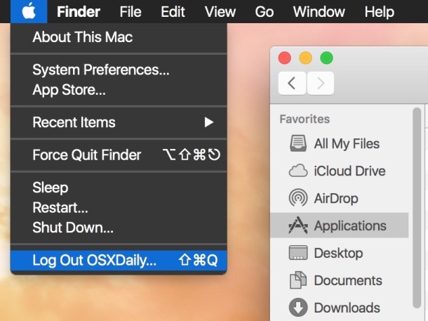
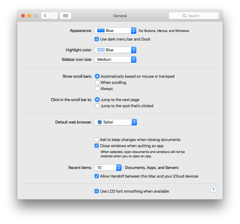
Here are a few screenshots showing what this patched El Capitan system font looks like in OS X Yosemite:
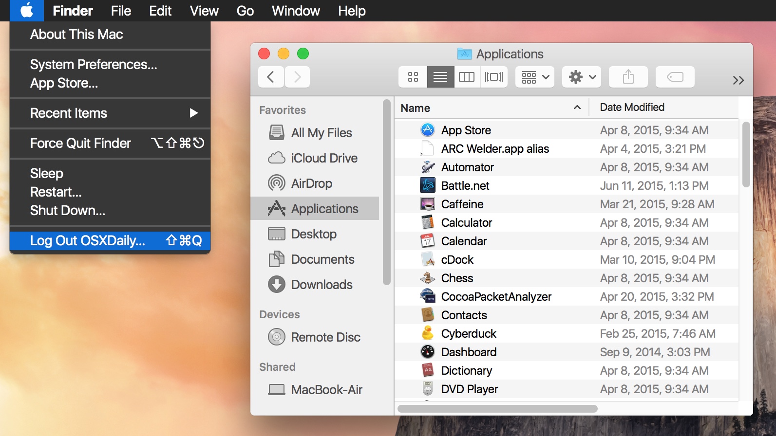
Finder:
System Preferences:
System fonts are largely a matter of personal preference, and some users may prefer the Yosemite default of Helvetica Neue, Comic Sans, or, my personal favorite, the Lucida Grande font, which was the default system font in OS X up until Apple changed it with Yosemite.
Even after changing the font, users who are not particularly thrilled with the system text appearance in OS X Yosemite may find that adjusting the font smoothing settings in Yosemite and using the increased contrast feature can help to improve general text legibility in OS X as well.
What do you think, do you like the El Capitan system font? Let us know in the comments.

I want to be able to change the font and its size to Apple Chancery
I am dealing with decreasing eyesight and need larger print. I also
do not like the fonts offered on OSX El Capitan. How can I get both
changed
I DON’T LIKE ANYTHING (UNDERLINED, BOLD) ABOUT
EL CAPITAN. I AM TRYING TO GET MY SNOW LEOPARD
RESTORED. THIS IS A BIG, BIG, MESS!
Does anyone know how to get Yosemite font on El Capitan?
The El Capitan font looks better with anti-aliasing off on my iMac 27 2011.
There’s a faster way than rebooting to make the font active after moving it to the Font Library: just Force Quit Finder.
A big contributor to the unreadability of System Fonts (and apps that adopt them) is that the fonts are GREY, not true black, contributing to LOW CONTRAST (even with the wimpy contrast tweaks turned on in Accessibility settings).
What should be a pure BLACK font is actually 35 to 40% toward grey rather than true black by my experimentation with Graphic Converter’s color manager. So, the contrast against a pure white background is low. Try inverting your screen (to white-on-black) using the Control-Option-Command-8 key combo, and the situation looks even worse.
The human eye is not designed to resolve detail under low contrast conditions, but that is what users of Yosemite are being asked to do. Trying to do so will raise your Intra Ocular Pressure (think Glaucoma), as well as tire your extra ocular eye muscles and give you eye strain. If you have migraines or need new glasses, send the bill to Johnny…
Agree completely, the lack of using black text in OS X El Capitan and OS X Yosemite makes the fonts incredibly difficult to read on screen. The low contrast is awful and “high contrast” mode looks like something a comedian would draw up as a joke. Very disappointing for a company that prides itself in accessibility and usability!
This has been a peeve of mine for a while new on OS X. This whole dark gray on light gray theming has been a disaster for my old eyes. What on earth was ever wrong with having color in icons and readable text…
Isn’t about time that Apple has a choice on system fonts? Yeah, I get that many fonts are unsuitable for system use but why isn’t there a choice of “approved” fonts for the user to choose from?
It can’t be that complicated.
Ooops…. looks like I’m late to the choices idea…. See above comment…
How about just give us (users) the ability in System Preferences to choose from a palette of Fonts?
This way people can use whatever font work best for them.
This is much too reasonable a request for Apple, where the Jony Ive school of design seems to be: you can have any design you want as long as it’s the one I like.
Simply dropping San Francisco into the Library/Fonts does nothing here to 10.10.4. Reboot, reboot. No effect.
I tried the new Font only to have to revert back because it caused weird characters when using a dialog box, particularly the password input dialog to provide administrator access. Not good! Anyone else had this problem?
Yes I’ve had that too, had to clear font caches
https://osxdaily.com/2015/01/08/clear-font-caches-databases-mac-os-x/
Be sure it’s in /Library/Fonts/
Lucida Grande is the best font option, has no problems BTW and looks great.
Thanks for that I might give it a try.
I don’t think it’s wise to advise people to go mucking around with system level fonts. I have dealt with some rather adventurous users who decided to modify system fonts and then quickly found out that the results are often not good. Simply placing fonts in the /Library/Fonts or /System/Library/Fonts folders is not enough. You must also make sure that the permissions are correct for the fonts you just added. It’s better to to just leave your system fonts alone and wait for El Capitan.
There’s no advice to do anything, it’s instructions on how to do something. If all instructions were blindly interpreted as advice, you’d see a lot of really funny things in the world. For example, I have a book on my desk on how to remodel a kitchen using recycled components, but you can bet I’m not about to take on that process. If people can’t tell the difference between doing something and having an option of doing something, and knowing when it applies to them, then may a supreme being help us all.
Ridiculous. If you want to change your system font, there is no reason that you can’t do so safely. (I haven’t bothered, but I would if I wanted to.)
It will be interesting to see if a class action suit arises against Apple for ruining users eyesight by switching to skinny, grey fonts in their OS.
They don’t read well in bright light in iOS either.
The Emperors set of new clothes designed by Ives and his minions is
bloody atrocious.
I tried different subtitutions to the Helvet. and I feel San Fancisco is a slight improvement, yet not enough. I agree that Lucida remains a better option. However, my favorite now is something tottally different: Input System font which you can know and download at http://input.fontbureau.com/systemfont/
Maybe you should try!
Far too “computerish”, judging from the screen shot. It doesn’t go with the look of the UI.
Hey look – you already posted this article a while ago – https://osxdaily.com/2015/05/20/use-san-francisco-system-font-in-os-x/ – at least you got the instructions right this time!
Clever Steve, but perhaps you should read the article a bit more closely. Second paragraph:
The fonts in use are different.
Ah, very good then! I didn’t realize they had done a switcheroo. Carry on!
Better yet. Just run os x eco captain.
OS X Eco Captain? Is that OS X 10.12? Eco Captain is the next version of OS X after El Capitan? Cool! My Mac can run OS X Eco Captain! Can yours?
The font is too narrow. It’s a bad font.
The Mac system font fiasco continues in OS X!
The Yosemite font of Helvetica Neue is awful and hard to read, it looks absolutely dreadful on non-retina screens, and requires precision vision on a retina display to not induce a headache.
The EL Capitan font of San Francisco font is also awful and difficult to read subject to the same conditions as the previous Helvetica Neue mess, though a tiny improvement. It’s still an inferior system font.
Using Lucida Grande is the only reasonable choice, it was used for over a decade with no complaints in OS X.
Apple is changing something for the sake of change, not for the sake of improvement. That is never a good choice!
Thank you Jony Ive.
Maybe get yours eyes checked? It looks fantastic on my retina and my 2 other office monitors.
Maybe YOU should get your eyes checked? The op is clear about this being a problem on non-retina macs, so however it looks on your retina display, is irrelevant here.
I have the same problem on my beefed out 2014 non-retina iMac 27″, and as I have to use Windows on it in order to not strain my eyes after installing Yosemite(and now El Capitan, which has the same problem), I will probably not buy another mac in the future. Why bother, when Apple shows a so completely disregard to every Mac customer that has bought a non-retina display the last couple of years.
If I have to run Windows on my expensive mac anyway in order to get full use of the display(and no, lowering the resolution makes everything look like shit, so that is not a good solution), I think I’ll buy regular PC the next time. I mean, who knows whats the next “improvement” they introduce will be that will make expensive Mac hardware obsolete overnight.
Completely agree, LS. There’s a reason most paper books are published with serif fonts. Not that I think a system font has to be serif, but if the goal is readability, especially at small sizes, then san-serif fonts suck. When computers had much lower resolution screens, san-serif like Helvetica made sense. With a retina display, you have pretty much surpassed the printed page. Yeah yeah, I get the whole “clean” and new-looking thing, but Apple has seriously lost its way. They used to make design choices for very good, intuitive reasons. Now, Ive changes something just to be “cool”. The result is that their current iOS system violates about 3/4 of their own immutable interface “rules” from the 90’s, and I’m not talking about style, but rather usability. Sad.
Actually, you’re only half right. Serif fonts are more readable on paper, but screen resolution is *still* lower than print resolution, and therefore sans-serif fonts still make more sense on a typical computer screen. (For the record, I thought Helvetica looked bad as a menu font on Yosemite, until I switched to a dark menu bar. Now I really like it. Not sure how I feel about San Francisco yet.)
“System font fiasco!” Give me a break you whiner.